Progressively Enhanced Form Validation, Part 3: Validating a checkbox group

Part 1 and Part 2 of this series explore the browser’s built-in HTML and CSS form validation features and how to progressively enhance the experience by layering JavaScript using the Constraint Validation API.
This article extends that exploration by focusing on a form validation use case that is not handled by the browser’s native validation features: a checkbox group.
Feel free to view the demo for this article as a reference. The source code is available on GitHub.
A checkbox group is a series of checkbox input types with the same name attribute value. For example, below is a simplified version of the “interests” checkbox group from the demo:
<fieldset>
  <legend>Interests <span>(required)</span></legend>
  <input id="coding" type="checkbox" name="interests" value="coding" />
  <label for="coding">Coding</label>
  <input id="music" type="checkbox" name="interests" value="music" />
  <label for="music">Music</label>
  <input id="art" type="checkbox" name="interests" value="art" />
  <label for="art">Art</label>
  <input id="sports" type="checkbox" name="interests" value="sports" />
  <label for="sports">Sports</label>
</fieldset>Code language: HTML, XML (xml)
Notice that a fieldset element wraps the checkboxes and includes a legend describing the group. It’s a good practice to wrap a group of checkboxes (or any related form elements) in a fieldset element as it improves semantics, accessibility, and visual organization.

Unlike a radio group, there isn’t a native HTML validation feature to mark a checkbox group as “required” (where at least one checkbox must be selected). Since we cannot validate using browser built-in features, we’ll need to add custom JavaScript.
For this demo, we’ll focus on the following:
- Implementing the real-time validation pattern: Validate when any checkbox within the group is checked/unchecked
- Implementing the late validation pattern: Validate when the group loses focus when keyboard tabbing through the interface
- Adding the validation logic: At least one interest must be selected from the group
- Toggling the checkbox visual validation state: Toggle
is-invalid/is-validCSS classes appropriately - Adding an accessible custom error message: Show a custom error message when applicable
- Adding a group validation state icon and
aria-invalidvalue: Individual icons per checkbox don’t make sense; consider accessibility - Hooking into the existing form submit handler: Use the existing
onSubmithandler flow - Include the checkbox group in the “first invalid input” focus: Automatically set focus to the group when the form is submitted if it’s the first invalid “input”
- Selectively validate the checkbox group on page load: Handle if a checkbox is checked on page load
There may be room for improvement, but implementing the above requirements provides a solid, enhanced experience when JavaScript is available.
Let’s dive in!
Implementing the real-time validation pattern
Let’s start adding some JavaScript. We’ll begin by adding a function, validateInterestsCheckboxGroup, that we can call to validate the group of checkboxes (we’ll fill in this function’s logic shortly). The function will accept the form element as an argument:
/**
 * Validates the "interests" checkbox group.
 * Custom validation is required because checkbox group validation
 * is not supported by the browser's built-in validation features.
 * @param {HTMLFormElement} formEl The form element
 * @return {boolean} Is the "interests" checkbox group valid?
 */
const validateInterestsCheckboxGroup = (formEl) => {
  // Validation logic will go here…
}
Code language: JavaScript (javascript)
Now let’s set up the change event listener to hook up real-time validation (a live validation pattern).
change event instead of an input event for the checkboxes?
Why use a change event instead of an input event for the checkboxes?
Input elements of type="checkbox" or type="radio" have inconsistent browser behavior when using the input event. Per MDN Web Docs, the change event is suggested instead for these input types.
We can add the change event listener code in the init function introduced in Part 2 so it can initialize with the rest of the form validation logic:
- Select all inputs with a
namevalue of “interests” (the checkboxes) - For each checkbox input, add a
changeevent listener withvalidateInterestsCheckboxGroupas the callback function - Make sure to pass along the
formElas the argument
/**
 * Initialize validation setup
 */
const init = () => {
  const formEl = document.querySelector('#demo-form');

  // Existing code from Part 2 here…

  // Set up event listeners to validate the "interests" checkbox group.
  document
    .querySelectorAll('input[name="interests"]')
    .forEach((checkboxInputEl) => {
      // Updates the UI state for the checkbox group when checked/unchecked
      checkboxInputEl.addEventListener('change', () =>
        validateInterestsCheckboxGroup(formEl)
      );
    });
};

Code language: JavaScript (javascript)Thoughtful consideration when adding real-time validation
As previously noted, carefully consider when adding real-time validation, as not all users appreciate live validation feedback. A group of checkboxes is a more appropriate use case for real-time validation since after a single action (press/click), the user is “done” checking or unchecking the input, unlike a text input where a single action (typing one character) may not complete the user’s full intent.
To test things are working, we can add a console.log in the validateInterestsCheckboxGroup function we created above:
const validateInterestsCheckboxGroup = (formEl) => {
  console.log('Validate the "interests" checkbox group');
}
Code language: JavaScript (javascript)console.log message.
Fantastic, the correct wires are connected! This sets us up to validate the group when any checkboxes are checked or unchecked.
Implementing the late validation pattern
Per our requirements above, when navigating through the interface with a keyboard, the checkbox group should be validated when a user tabs out of the group. This live validation pattern is known as “late validation.”
Setting up the late validation pattern requires a touch of extra logic for a group of checkboxes. For example, if it were a single checkbox input, we’d want the validation to happen immediately when the single checkbox’s blur event fires. However, we only want the validation to run for a checkbox group when the focus has left the group.
The following logic gets us what we need:
- Add a
blurevent to each of the checkbox inputs in the group - On
blur, check theFocusEvent.relatedTargetto see if it is one of the checkboxes - If it is not one of the checkboxes, run the validation
FocusEvent.relatedTarget?
What is the FocusEvent.relatedTarget?
For a blur event, the FocusEvent.relatedTarget is the element receiving focus (the EventTarget). In our case, we can use this to tell if the element receiving focus is or is not one of the “interests” checkbox inputs.
We can add the blur logic alongside the previously added change event listener:
const init = () => {
  const formEl = document.querySelector('#demo-form');

  // Existing code from Part 2 here…

  // Set up event listeners to validate the "interests" checkbox group.
  document
    .querySelectorAll('input[name="interests"]')
    .forEach((checkboxInputEl) => {
      // Updates the UI state for the checkbox group when checked/unchecked
      checkboxInputEl.addEventListener('change', () =>
        validateInterestsCheckboxGroup(formEl)
      );
      // Set up late validation for the checkbox group
      checkboxInputEl.addEventListener('blur', (event) => {
        // FocusEvent.relatedTarget is the element receiving focus.
        const activeEl = event.relatedTarget;
        // Validate only if the focus is not going to another checkbox.
        if (activeEl?.getAttribute('name') !== 'interests') {
          validateInterestsCheckboxGroup(formEl);
        }
      });
    });
};

Code language: JavaScript (javascript)
Excellent! That wasn’t terrible to figure out (props to Paul Hebert for pointing me to the FocusEvent.relatedTarget MDN docs 🙂).
Below, notice the console.log message prints only when the focus leaves the group of checkboxes (and not when tabbing between the checkbox inputs):
Adding the validation logic
We can now add the code to validate the checkbox group inside the validateInterestsCheckboxGroup function. The logic will be as follows:
- Use the
getAllmethod from theFormDataAPI to confirm at least one checkbox is checked - Use the result to return a boolean representing the “Is the checkbox group valid?” state
FormData API?
What is the FormData API?
The FormData API provides a concise way to interact with field values from an HTML form. The API feels intuitive and is well-supported. For example, the FormData.getAll method returns an array of all the values for a given key, an excellent choice for a checkbox group.
Note: Input fields must have a name attribute to be retrieved by the FormData API.
Replace the console.log with the following logic:
const validateInterestsCheckboxGroup = (formEl) => {
  // Are any of the "interests" checkboxes checked?
  // At least one is required.
  const formData = new FormData(formEl);
  const isValid = formData.getAll('interests').length > 0;

  // Return the validation state.
  return isValid;
}
Code language: JavaScript (javascript)
Not too bad! We now have the checkbox group logic to drive the rest of the validation experience.
Toggling the checkbox visual validation state
With the validation logic in place, we can leverage it to provide visual feedback. In the validateInterestsCheckboxGroup function, we’ll want to:
- Select all of the “interests” checkboxes
- Reference the
isValidboolean to toggleis-invalid/is-validCSS classes for each checkbox
const validateInterestsCheckboxGroup = (formEl) => {
  // Code from above here…

  // Get all the "interests" checkboxes.
  const interestsCheckboxInputEls = document.querySelectorAll(
    'input[name="interests"]'
  );

  // Update the validation UI state for each checkbox.
  interestsCheckboxInputEls.forEach((checkboxInputEl) => {
    checkboxInputEl.classList.toggle('is-valid', isValid);
    checkboxInputEl.classList.toggle('is-invalid', !isValid);
  });

  // Return the validation state.
  return isValid;
}
Code language: JavaScript (javascript)
With that in place, the checkboxes’ visual validation state now updates. Hooray!
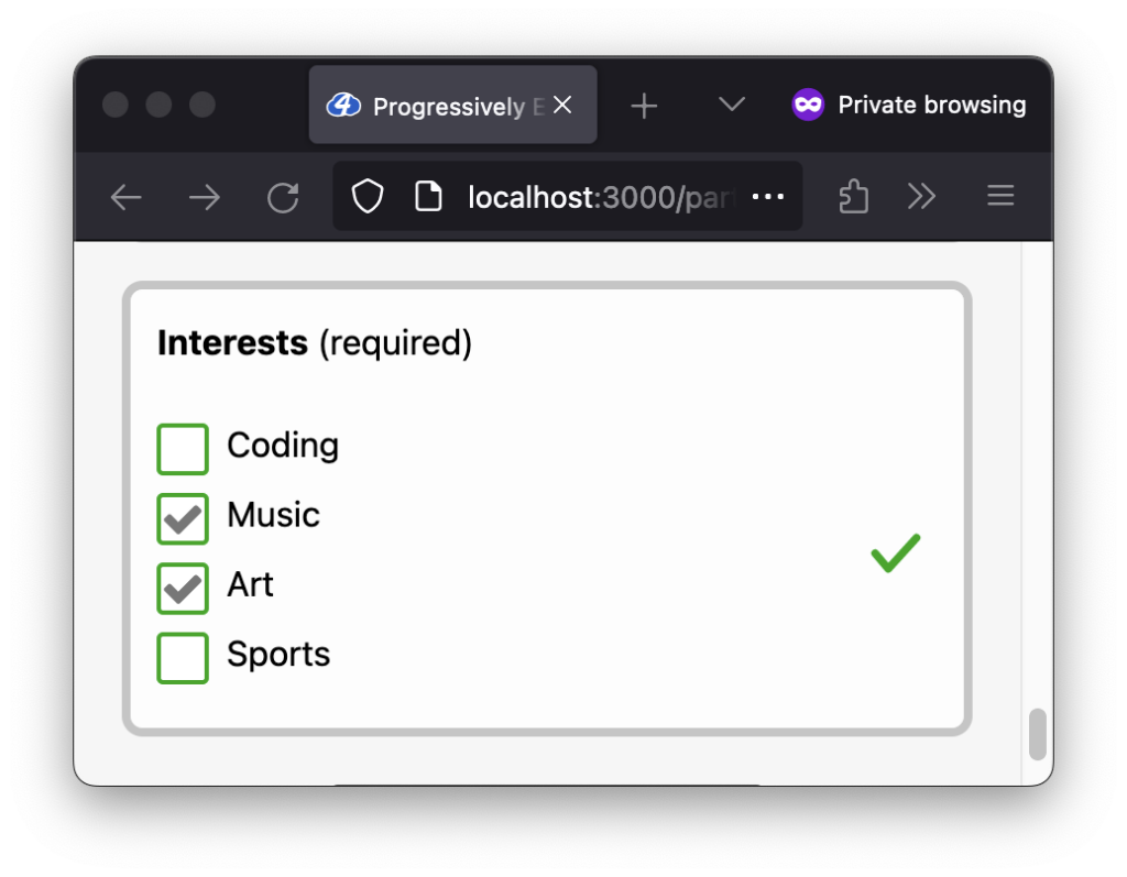
Below you can see the real-time validation pattern in action. Notice the checkbox border color changes between a “valid” (green) and “invalid” (red) state when checked/unchecked:
The late validation pattern is now also updated visually. The border color for all of the checkboxes renders the “invalid” (red) state when the keyboard focus leaves the group if no checkbox was selected:
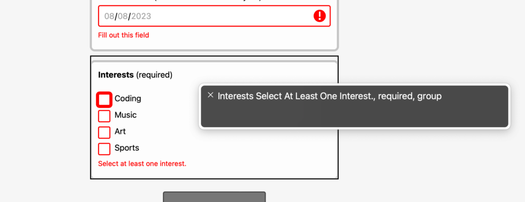
Adding an accessible custom error message
In Part 2, we created a more accessible experience by adding an aria-describedby attribute on the individual inputs pointing to the ID of their respective error message elements.
We need to use a different pattern for the checkbox group because we want to associate the error message with the group as a whole.
The pattern we’ll implement includes injecting the error message into the legend element. When using a screen reader, for example, the validation feedback will be incorporated when the screen reader reads the legend.
While this pattern is a bit more complicated, it was the most inclusive pattern I could find based on my research which also included reaching out to the web-a11y.slack.com community. Theoretically, the pattern could be simplified by only adding an aria-describedby attribute to the fieldset element, but unfortunately, there is an NVDA bug where the aria-describedby attribute is not respected for a checkbox group. A helpful resource for me was a great article by Tenon, “Accessible validation of checkbox and radiobutton groups,” where they explore various checkbox group validation patterns.
Let’s start with the HTML updates, which include adding some ARIA attributes:
- In the
fieldsetelement: Add anaria-requiredattribute to provide extra feedback when using assistive technologies like a screen reader - In the
legendelement: Add anaria-hiddenattribute to the “(required)” text- This “required” text provides visual feedback but is redundant when using assistive technology devices
We’ll also be adding two empty error message elements; one that assistive technologies will pick up (visually hidden) and one for users who are sighted (visible but hidden from assistive technologies):
- First empty error message element: Place it inside the
legend- Visually hide the element via a
visually-hiddenCSS class - Includes a
js-interests-legend-errorCSS class to attach JavaScript logic
- Visually hide the element via a
- Second empty error message element: Place it below the last checkbox input
- Has
hiddenattribute as the default state - Hidden from assistive technologies via
aria-hiddenattribute so duplicate error messages aren’t conveyed - Includes a
js-interests-visual-errorCSS class to attach JavaScript logic
- Has
Why two error message elements?
Adding two error message elements may seem redundant, but there’s a good reason. We add the first empty error message element within the legend element so that assistive technologies, like screen readers, can associate the error message with the checkbox group. But that doesn’t match our visual design, so we visually hide it. The second empty error message element is added to match the visual design; we hide it from assistive technologies so the error message doesn’t get conveyed twice.
<fieldset aria-required="true">
  <legend>
    Interests <span aria-hidden="true">(required)</span>
    <span class="visually-hidden js-interests-legend-error">
      <!-- Text content set by JS -->
    </span>
  </legend>
  <div class="field-wrapper checkbox-field-wrapper">
    <!--
      Checkboxes and label elements here…
    -->
    <p hidden aria-hidden="true" class=js-interests-visual-error">
      <!-- Text content set by JS -->
    </p>
  </div>
</fieldset>
Code language: HTML, XML (xml)
In the JavaScript, we can update the validateInterestsCheckboxGroup function as follows:
- Get both empty error message elements via their
js-*classes - Set the error message depending on the
isValidboolean - Toggle the
hiddenattribute on the visible error element accordingly
const validateInterestsCheckboxGroup = (formEl) => {
  // Existing code from above here…

  // Get both the legend and visual error message elements.
  const legendErrorEl = document.querySelector('.js-interests-legend-error');
  const visualErrorEl = document.querySelector('.js-interests-visual-error');

  // Update the validation error message.
  const errorMsg = isValid ? '' : 'Select at least one interest.';

  // Set the error message for both the legend and the visual error.
  legendErrorEl.textContent = errorMsg;
  visualErrorEl.textContent = errorMsg;

  // Show/hide the visual error message depending on validity.
  visualErrorEl.hidden = isValid;

  // Return the validation state.
  return isValid;
}
Code language: JavaScript (javascript)
Wonderful! We now have an accessible validation error message. Below you can see the error message visually displayed:
If using a screen reader, in this example, VoiceOver with Safari on macOS, the validation feedback is included with the legend. Also, notice the “required” feedback provided by the aria-required attribute on the fieldset:
legend is read. Pictured is VoiceOver in Safari on macOS.
aria-invalid value
Adding a group validation state icon and aria-invalid value
In Part 2, each individual input had its own “valid”/”invalid” state icon and aria-invalid attribute. We need to move those out onto the fieldset for a checkbox group.
Need a refresher on aria-invalid? See “What does aria-invalid do?” in my previous article.
Let’s add a js-* CSS class to the fieldset so we can reference it in our JavaScript code:
<fieldset
  aria-required="true"
  class="js-checkbox-fieldset"
>
Code language: HTML, XML (xml)
Then, in the validateInterestsCheckboxGroup function, we can add the following logic:
- Get the
fieldsetelement via thejs-*CSS class - Depending on the
isValidboolean, update:- The
is-valid/is-invalidstate classes to toggle a single “valid”/”invalid” group icon - The
aria-invalidattribute
- The
const validateInterestsCheckboxGroup = (formEl) => {
  // Existing code from above…

  // Get the fieldset element for the "interests" checkbox group.
  const checkboxFieldsetEl = document.querySelector('.js-checkbox-fieldset');

  // Need to place the validation state classes higher up to show
  // a validation state icon (one icon for the group of checkboxes).
  checkboxFieldsetEl.classList.toggle('is-valid', isValid);
  checkboxFieldsetEl.classList.toggle('is-invalid', !isValid);
  // Also update aria-invalid on the fieldset (convert to a string)
  checkboxFieldsetEl.setAttribute('aria-invalid', String(!isValid));

  // Return the validation state.
  return isValid;
}
Code language: JavaScript (javascript)
Sweet! We can see a single group validation state icon in action below:
When using VoiceOver with Safari on macOS, the aria-invalid attribute adds “invalid data” to the validation feedback for the group:
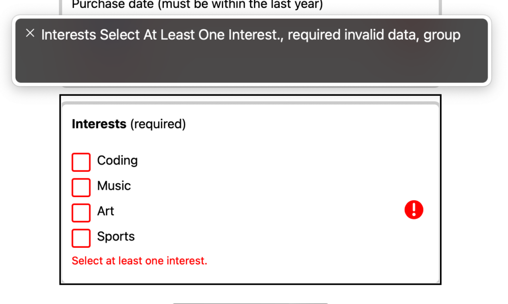
aria-invalid="true" is added to the fieldset.Hooking into the existing form submit handler
In the previous article, we set up the logic for the form submit event. Adding the checkbox group validation into the existing submit flow will be relatively straightforward.
Just a moment ago, in the validateInterestsCheckboxGroup function, we added logic that stores and returns the validation state via the isValid boolean:
const validateInterestsCheckboxGroup = (formEl) => {
  // Existing code from above…

  // Return the validation state.
  return isValid;
}
Code language: JavaScript (javascript)
We can use the returned boolean value to include the checkbox group validation within the existing onSubmit flow. We can add the following logic to that flow:
- Call the
validateInterestsCheckboxGroupfunction and store the returned boolean value - Include the returned boolean value in the “Is the form valid” check
const onSubmit = (event) => {
  // Existing onSubmit code from Part 2…

  // Fields that cannot be validated with the Constraint Validation API need
  // to be validated manually. This includes the "interests" checkbox group.
  const isInterestsGroupValid = validateInterestsCheckboxGroup(formEl);
  // Prevent form submission if any of the validation checks fail.
  if (!isFormValid || !isInterestsGroupValid) {
    event.preventDefault();
  }
};
Code language: JavaScript (javascript)
And that’s it! Now, the checkbox group will also be validated when the form is submitted:
Include the checkbox group in the “first invalid input” focus
Some of the work in the form submit logic introduced in Part 2 was to set focus on the first invalid input when the form is submitted. We’ll want to ensure the checkbox group is included in this query.
To do so, we’ll need to make another update to the existing onSubmit handler as follows:
- Add a selector for the
inputin afieldsetthat has theis-invalidstate class (e.g.,'fieldset.is-invalid input')
const onSubmit = (event) => {
  // Existing onSubmit code from Part 2…

  // Set the focus to the first invalid input.
  const firstInvalidInputEl = formEl.querySelector(
    'input:invalid, fieldset.is-invalid input'
  );
  firstInvalidInputEl?.focus();
};
Code language: JavaScript (javascript)
Note: The order of operations matters here. The validateInterestsCheckboxGroup function must be called before attempting to query for fieldset.is-invalid input. Otherwise, the fieldset won’t have the is-invalid class to query by.
It’s almost like magic! Below, you can see the group’s first checkbox input receiving focus when no checkbox is selected and the form is submitted:
Selectively validate the checkbox group on page load
We are near the finish line! One last thing to do. Currently, the checkbox group validation will only happen when a checkbox input’s change, blur, or form submit events fire. There is one more case we should handle: What if a checkbox is checked and the browser reloads the page?
Ideally, if the page loads with at least one selection made, it should show the “valid” UI state. At the moment, nothing happens, and the checkbox group ends up in this unresolved state:
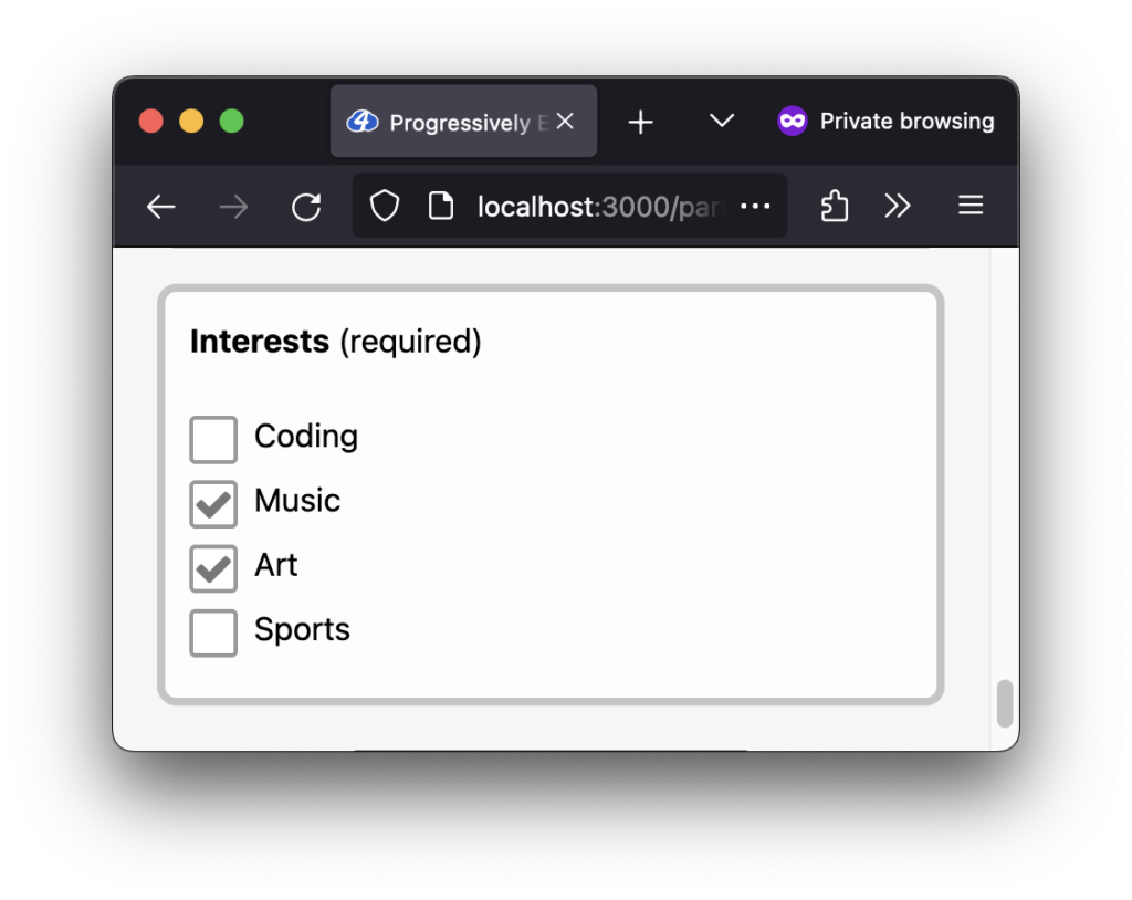
We can resolve this by adding the following logic to the existing init function from Part 2:
- Query for all “interests” inputs (the checkboxes) that have a
:checkedstate - If any are checked, run the
validateInterestsCheckboxGroupfunction so the “valid” UI state can render
/**
 * Initialize validation setup
 */
const init = () => {
  // Existing code from Part 2 here…

  // On page load, if a checkbox is checked, update the group's UI state
  const isInterestsGroupChecked =
    document.querySelectorAll('input[name="interests"]:checked').length > 0;
  if (isInterestsGroupChecked) {
    validateInterestsCheckboxGroup(formEl);
  }
};

Code language: JavaScript (javascript)
Easy peasy! Now, when the page loads with at least one checkbox selected, we see the “valid” UI state as expected:
Why not validate the checkbox group on every page load?
We don’t want to run the validateInterestsCheckboxGroup function every time the validation code is initialized because if no checkboxes are checked, then the “invalid” UI state will render. This pattern, called premature validation, is not helpful and leads to a frustrating user experience.
Future improvement opportunities
Because we can always learn more and keep growing, I wanted to note a few opportunities to improve the user experience.
- Localize the validation error message: Currently, the validation error message is hard-coded in English in JavaScript. Ideally, the message can be localized into different languages.
- Remove or minimize the layout shift when validation error messages are displayed: When the error messages are displayed, there is a visual layout shift. This issue is not specific to the checkbox group, but it becomes more prominent (and annoying) as more fieldsets/inputs are added to the form.
Wrapping up
That was fun! I’ll admit that the perfectionist in me almost gave up on finding an accessible validation solution for a checkbox group, but I’m glad I pushed through. Finding a solution feels good, even if not ideal, especially knowing the native HTML validation features leave us short.
Stick around for the following article, Part 4, where we explore using the Constraint Validation API’s ValidityState interface to help render custom validation error messages.
Until next time!
A special thank you to Juliette Alexandria, Adrian Roselli, and Joe Schunk, who provided me with feedback, resources, and confirmation for creating a more accessible checkbox group validation experience via the web-a11y.slack.com Slack community. 🙌🏽
More resources
- MDN Web Docs: Handling multiple checkboxes
- MDN Web Docs: Validating forms without a built-in API
- MDN Web Docs: Checkbox input type validation
- Support for Marking Radio Buttons Required, Invalid by Adrian Roselli
- “Use
<fieldset aria-requried="true">” and “Use<fieldset aria-invalid="true">” tweets from Adrian Roselli - Axe Rules: Checkbox inputs with the same name attribute value must be part of a group
- HTML.form.guide: HTML Form Checkbox with required validation
Missed an article in the series?
I’ve got you! Listed below are all of the articles from the series:
Gerardo Rodriguez is a developer driven by curiosity and the love of learning. His experience with art, design, and development make him a well-rounded maker of things on the web. You’ll find him sharing some thoughts and resources on Bluesky (@gerardo.bsky.social).