Jagged Little Pill: Issues with Rounded Buttons

Even though flat, minimal interfaces have been the rage for most of the decade, purely rectangular buttons aren’t as common as you’d think. Designers like me frequently “round” the corners, dulling those sharp points that might make an interactive element feel less inviting to tap or click.
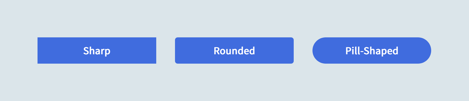
Sometimes we round them just a tad, softening the silhouette without losing the rectangle. But other times we enlarge those radii till the corners meet, forming a semicircle at each end… the “pill” shape. Pill-shaped elements have the added benefit of seamlessly collapsing to a circle where space is a concern and iconography is available.

In CSS, we accomplish this look by setting border-radius on the element. The larger the value, the more rounded the corners appear. Simple, right?
Not always! 😅
Issue 1: Touch/Click Target Size
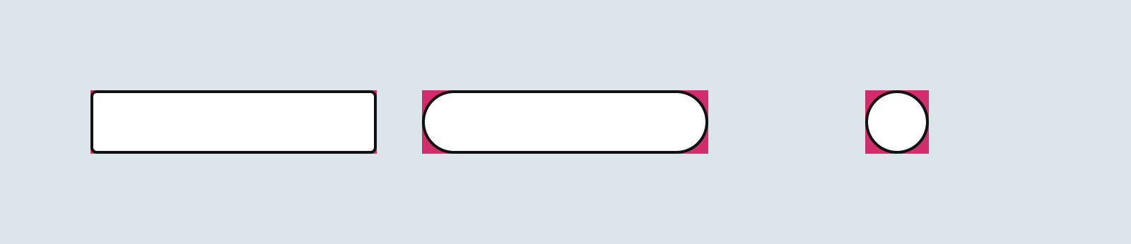
It’s easy to forget that border-radius isn’t a purely visual change… those lost corner pixels are no longer clickable! For smaller border-radius values or wider buttons, this loss in touch target size may be negligible. But a perfectly circular button will lose over 20% of its interactive surface area to its rounded corners!
Issue 2: Content Clipping in IE11 and Safari
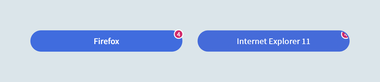
In addition to reducing the interactive surface area of the element, Internet Explorer 11 also acts as if overflow is set to hidden on <button> elements. This can cause unintentional clipping of overlaid elements like notification badges.
A similar issue can also crop up in Safari, but only for child elements with a position other than relative or absolute.
An Easier Pill to Swallow
We can address these issues by modifying our pattern in a few small ways.
First, we’ll introduce an “inner” element that represents the visual pill shape without reducing the surface area of the parent element. This will also solve our IE11 clipping issue by letting badges or other overlays live outside the pill:
<button class="Button">
  <span class="Button-inner">
    Example
  </span>
  <!-- badge, etc. -->
</button>Code language: HTML, XML (xml)
We’ll define some reset and normalization styles on the outer .Button:
.Button {
  background: transparent;
  border: 0;
  border-radius: 0;
  color: inherit;
  display: inline-block;
  font: inherit;
  height: auto;
  line-height: 1;
  margin: 0;
  padding: 0;
  position: relative;
  text-align: center;
  text-decoration: none;
  user-select: none;
}Code language: CSS (css)
With the bulk of the visual styles (including our rounded corners) and the WebKit/Safari overflow fix applied to .Button-inner:
.Button-inner {
  align-items: center;
  background: #456BD9;
  border: 2px solid transparent;
  border-radius: 99em;
  color: #fff;
  display: flex;
  font-weight: 600;
  height: 2.5em;
  min-width: 2.5em;
  padding: 0 1em;
  position: relative; /* WebKit Bug 173872 */
  transition: 0.2s ease;
  width: 100%;
}Code language: CSS (css)
Let’s also design some custom interaction states. First, we’ll unset some conflicting styles on the outer element (but only because we intend to replace them):
.Button:focus {
  outline: none;
}

.Button::-moz-focus-inner {
  border: 0;
}Code language: CSS (css)
Which means we can now style the inner element based on the state of its parent:
.Button:focus .Button-inner {
  border-color: #fff;
  box-shadow: 0 0 0 2px #456BD9;
}

.Button:hover .Button-inner {
  filter: brightness(1.1);
}

.Button:active .Button-inner {
  filter: brightness(0.9);
}
Code language: CSS (css)
And voilà! Pill-shaped buttons that work well across browsers without shrinking our touch targets or clipping any content:
Since this solution introduces more markup and won’t work with self-closing tags like <input> or <select>, it’s probably best avoided if your border-radius values are modest. When in doubt, have several people test your buttons on real devices to expose any issues.
Apologies to Alanis Morissette for the title of this article.
Tyler Sticka has over 20 years of experience designing interfaces for the web and beyond. He co-owns Cloud Four, where he provides multidisciplinary creative direction for a variety of organizations. He’s also an artist, writer, speaker and developer. You can follow Tyler on his personal site, Mastodon or Bluesky.