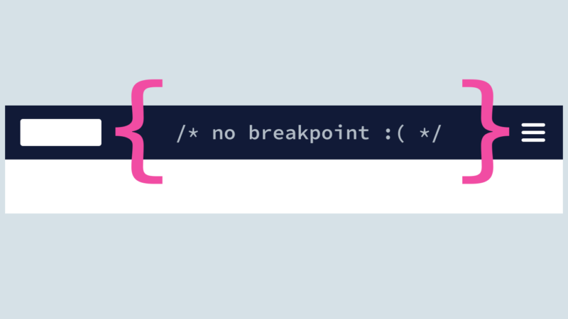
Breakpoints: Don’t Box Me In

Big responsive projects are complicated, and standardized breakpoints can help. But they can also encourage bad habits if we aren't careful.
You appear to be offline, some content may be unavailable.

Big responsive projects are complicated, and standardized breakpoints can help. But they can also encourage bad habits if we aren't careful.

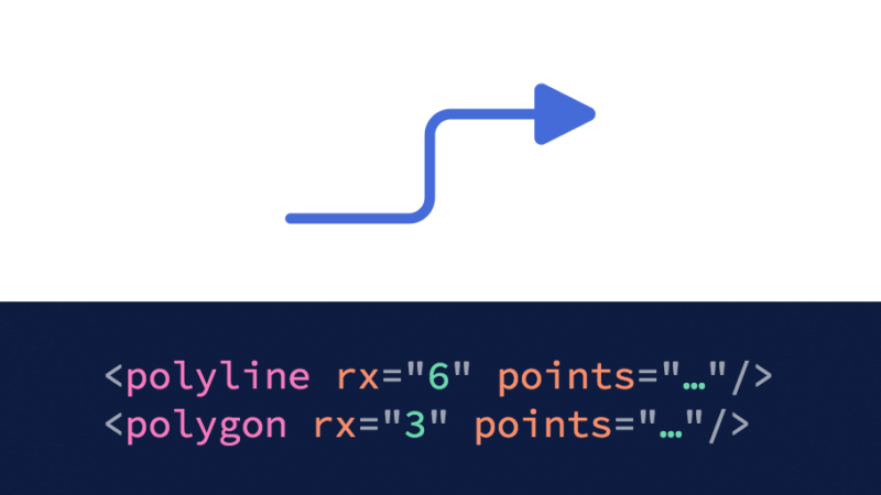
It's no secret: I love SVG. But it isn't perfect. Here are some features I hope eventually come to the standard, if not in SVG 2 then in some future successor (or even a preprocessor).

Here’s a neat little solution to a problem I encountered in my quest to use more animation in my interface design work. I was prototyping a sliding view transition between nested levels of…

Is web design — or even interface design in general — a solved problem?
Many techniques for cropping image thumbnails on the front-end require explicit dimensions, which is less than ideal for responsive design.
Confession: I don’t enjoy code. Not really. I know that sounds strange coming from someone who’s made over 2,000 code contributions this year. But it’s true: code, in and of itself, brings me little…

Shortly after we opened up Drizzle, our pattern library framework, Luke Askew started a wonderful discussion of pattern library maintainability in that project’s repository. This inspired me to reflect on the pattern libraries…

After months of redesigning in public, we’ve finally pushed the button that unleashed the new cloudfour.com on the world. For me, this project has been a dream come true. I was a…
It’s hard to believe it’s been over three years since Dave Rupert wrote Responsive Deliverables, challenging the rest of us to start making “tiny bootstraps, for every client.” It’s been almost as long since…
While iterating on a new article layout for the impending Cloud Four redesign, I encountered an old CSS layout problem. For long-form content, it’s usually a good idea to limit line lengths…