A Content List With Bulk Actions Using Ancient HTML and Modern CSS

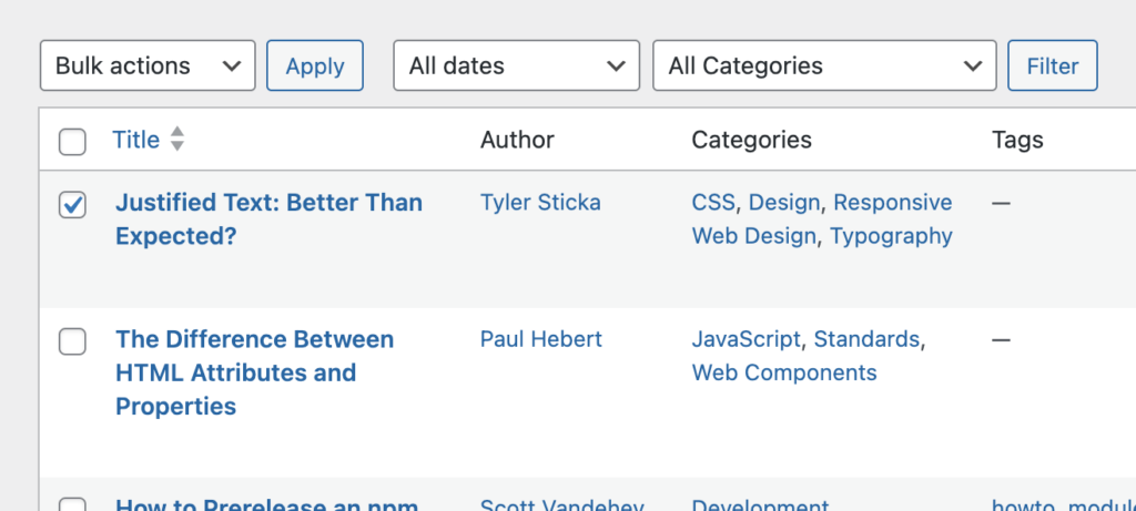
Here’s a pretty common pattern we see while designing responsive experiences or modernizing legacy applications. If you’ve used a cloud-based file manager, content management system or administrative UI, I’m sure you’ve seen it, too.
There’s a list of content. You can edit individual items by tapping or clicking their row, or you can select adjacent checkboxes to perform bulk actions.
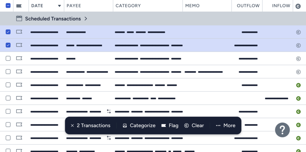
Some versions of this require no JavaScript, showing persistent bulk actions as form elements.
But most modern interfaces wait to reveal those controls until a selection is made. We can design big, touch-friendly bulk action controls, knowing they won’t monopolize the screen until selection has started.
Traditionally, that sort of thing requires JavaScript. So it’s been fun to surprise some of our customers’ development teams by delivering prototypes that mostly function with HTML and CSS alone.
Demo
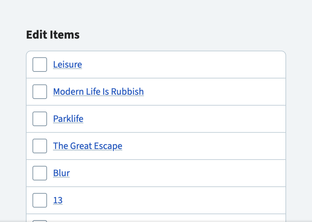
Here’s a simple example:
At first glance, this looks pretty ordinary. Each row links to a (hypothetical) edit page, each has its own checkbox.
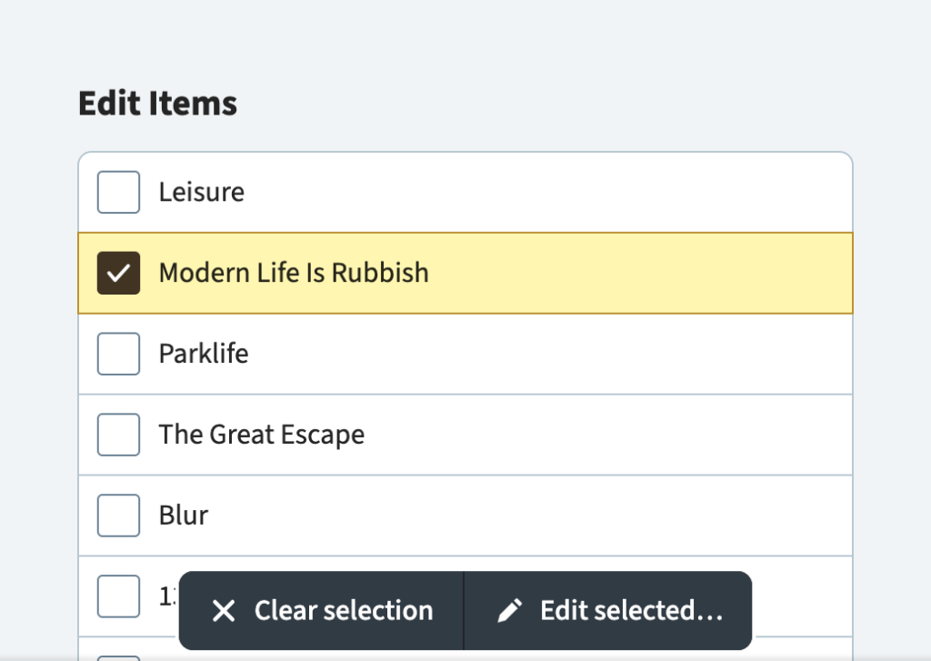
But once you check a box, some interesting things happen:
- A sticky bulk action toolbar is displayed.
- All rows become checkbox toggles, enabling faster selection without accidental navigation.
- The “Clear selection” button unchecks all the boxes.
So… how’s it work?
Markup
The demo consists of a form, a heading, a list of links and labelled checkboxes, and two buttons:
<form action="…">
  <h2>Edit Items</h2>
  <ul>
    <li>
      <a href="…">(item title)</a>
      <label for="…">
        <input type="checkbox" id="…">
        <span>Add "(item title)" to selection</span>
      </label>
    </li>
  </ul>
  <div>
    <button type="reset">
      Clear selection
    </button>
    <button type="submit">
      Edit selected…
    </button>
  </div>
</form>Code language: HTML, XML (xml)
The button with type="reset" reverts all of the checkboxes to their initial unchecked state when clicked. The other button submits the form, which will GET or POST all the checked boxes.
(I affectionately call this HTML “ancient,” since there’s nothing here you won’t find in the decades-old HTML 4 specification.)
Need more actions?
Additional <button> elements may override the parent form’s action, method and more:
<button type="submit">
  Edit
</button>
<button
  type="submit"
  formaction="/path/to/delete/endpoint">
  Delete
</button>Code language: HTML, XML (xml)
For more details, see this helpful overview from Stefan Judis.
Styles
The real star of the CSS show here is the :has selector. We can combine this with :checked to detect when a selection is in progress:
.example:has(:checked) {
  /* do things when boxes therein are checked */
}Code language: CSS (css)
The demo uses this feature in two main ways…
Expanding the Checkbox Toggle Area
As mentioned in the previous section, each item (or row) contains a link and a label with a nested checkbox:
<li class="item">
  <a class="item__link" href="…">(title)</a>
  <label class="item__label" for="select-1">
    <input class="item__input checkbox" type="checkbox" id="select-1">
    <span class="u-hidden-visually">Add "(title)" to selection</span>
  </label>
</li>Code language: HTML, XML (xml)
Note the utility class on the <span> element, which lets us hide the element visually (while keeping it accessible to screen readers) using this classic technique:
.u-hidden-visually {
  block-size: 1px;
  border: 0;
  clip: rect(0 0 0 0);
  clip-path: polygon(0 0, 0 0, 0 0);
  inline-size: 1px;
  margin: -1px;
  overflow: hidden;
  padding: 0;
  position: absolute;
  white-space: nowrap;
}Code language: CSS (css)
(Spoiler: We’ll use this again in the next section.)
We compose the remaining, visible items with CSS grid using named lines (a technique I’ve written about before). Named lines are more verbose than grid-template-areas, but I find them more intuitive when I want several areas that overlap.
In this (slightly simplified) example, the full area overlaps both the label and link areas:
.item {
  display: grid;
  grid-template-columns: [full-start label-start] auto [label-end link-start] minmax(0, 1fr) [link-end full-end];
  grid-template-rows: [full-start label-start link-start] auto [full-end label-end link-end];
}Code language: CSS (css)
That may seem like a lot, but here’s the payoff: Now anytime there’s a checked box, we can stretch the label over the whole element by updating a single property.
.item__label {
  grid-area: label;
}

.items:has(:checked) .item__label {
  grid-area: full;
}Code language: CSS (css)Revealing Bulk Actions
By comparison, showing the bulk action toolbar seems straightforward.
First, we make it sticky:
.actions {
  inset-block-end: 0.375em;
  position: sticky;
}Code language: CSS (css)
Then, we hide that element when there aren’t any checked boxes:
.listing:not(:has(:checked)) .actions {
  display: none;
}Code language: CSS (css)
And we’re done, right? Well, not exactly.
Unfortunately, display: none will hide those controls from everyone. This denies users of assistive devices important context for the form and its functions.
So let’s do the right thing and make a couple small changes:
- Instead of
display: none, let’s piggy-back on thoseu-hidden-visuallystyles from the previous section. - And let’s only apply those styles here if the elements therein lack visible focus. Otherwise, keyboard users could focus invisible buttons, which seems confusing.
.listing:not(:has(:checked)) .actions:not(:has(:focus-visible)),
.u-hidden-visually {
  /* same technique as the previous section */
}Code language: CSS (css)
That’s all the major behavior accounted for. Everything else in the demo is presentational.
A Starting Point
I wouldn’t consider this design shippable before exploring improvements that likely require JavaScript (for now, anyway). Things like:
- A dynamic selection count (in case any have scrolled out of view)
- A “Select all” function
- Sorting
- Filtering
- The ability to shift-click to select spans of items
- Deferring checkboxes till we’ve entered a selection mode
- …and probably more!
But as a foundation for progressive enhancement or, in my case, an in-browser mockup, it’s really exciting (and fun) how far HTML and CSS alone can take us.
Tyler Sticka has over 20 years of experience designing interfaces for the web and beyond. He co-owns Cloud Four, where he provides multidisciplinary creative direction for a variety of organizations. He’s also an artist, writer, speaker and developer. You can follow Tyler on his personal site, Mastodon or Bluesky.
