You appear to be offline, some content may be unavailable.
World’s largest retailer goes responsive thanks to cutting-edge design approach
Walmart chose Cloud Four to guide their transition to responsive design. We started with the grocery experience, converting the site to a responsive design in three months. We finished a week ahead of schedule thanks to our responsive design sprint approach.
Walmart had recently completed an expansive, fixed-width redesign, so any plan that required a full rework was out of the question. But they also weren’t interested in stop-gap solutions they’d need to replace in short order. They needed a thoughtful, responsive iteration on their existing foundation.
Fortunately, we have a lot of experience with responsive conversions—taking a working fixed-width design and making it responsive.
Responsive design, one pattern at a time
Walmart Grocery (then known as Walmart To Go) was the perfect starting point: Smaller in scope than Walmart.com, self-contained, and high-growth. We began collaborating closely with the team at Walmart Labs, sharing ideas, imagery and feedback in real-time using Slack.
The key to our velocity was breaking the larger effort into smaller patterns. We might start with a button, creating rapid prototypes to enhance their flexibility while making sure all its various states are touch-friendly:
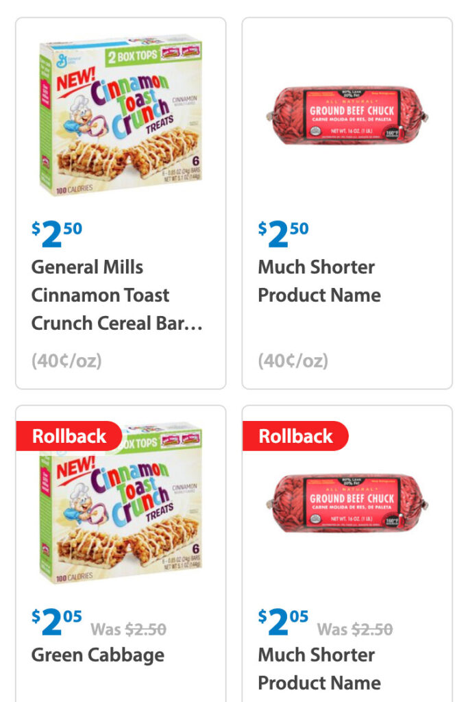
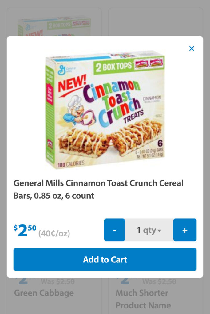
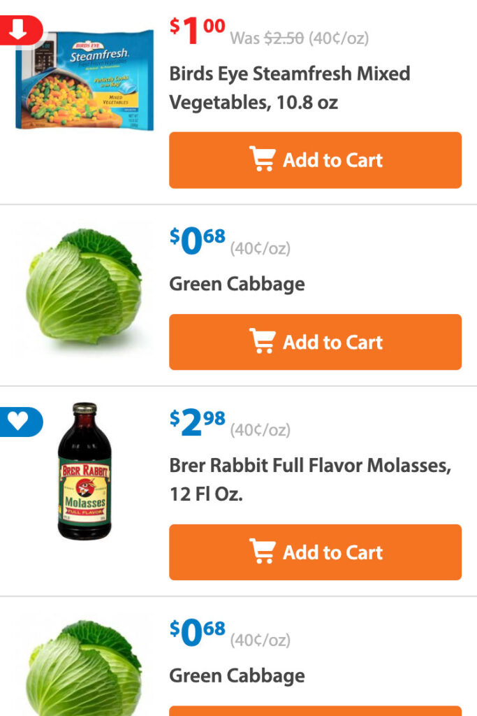
Which we’d then combine with other patterns to form larger combinations, iterating on more complex elements like product tiles:
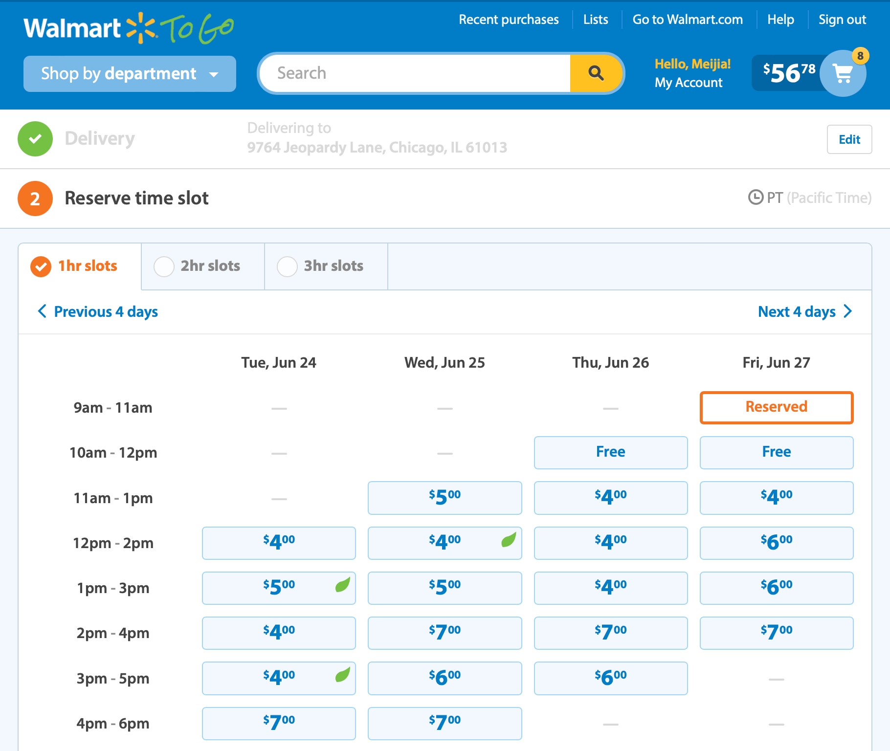
Until we had enough patterns to reconstruct the original interface, now fully responsive:
This fully responsive, in-browser prototype of a product listing with persistent cart showcases many smaller responsive patterns.
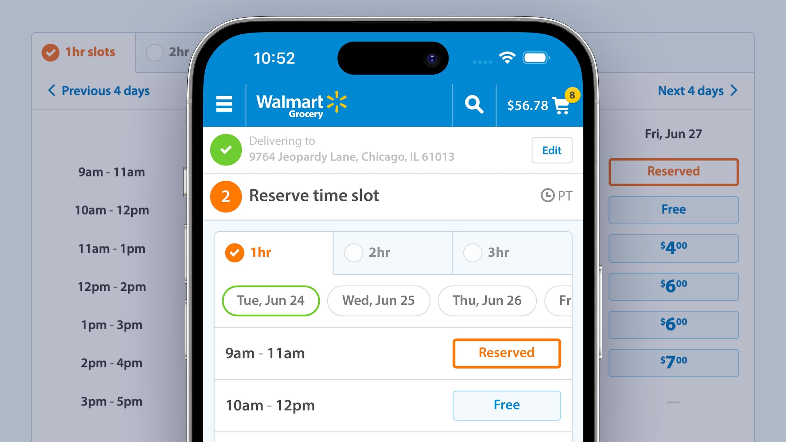
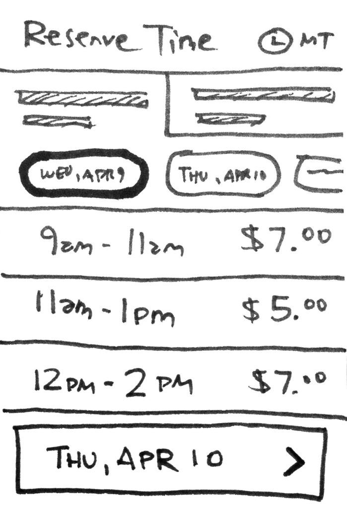
That’s not to say we addressed interface challenges in isolation. A complex task like scheduling deliveries called for a more holistic approach, starting from loose ideation informing some initial prototypes:
Ultimately leading to the fully realized interfaces that shipped:
On small screens, animation conveys the relationship between dates.Time slots are arranged in a grid as space allows, consistent with the original fixed-width design.
Expansion
After proving ourselves on the Grocery project, Walmart was eager to leverage our skills in other areas. We applied the same process to cart and checkout, portions of product pages, consulted on responsive images, developed single-page web applications, contributed to their design system and collaborated on front-end implementations of Walmart designs.
Cloud Four invited two of our frequent Walmart collaborators, Ola Oladunni and Mini Kurhan, to present “Responsive Heroes at Scale” at Responsive Field Day
Impact
It’s hard to overstate Walmart’s success: They are the world’s largest retailer and one of the top three ecommerce retailers. It’s humbling to have contributed to that legacy. But we’re especially proud of the grocery experience: What started as a collection of responsive patterns and prototypes has grown into a service that has bolstered ecommerce growth, won ardent fans, and made life easier during a global pandemic. What greater example of our outsized impact could we ask for?
Finding a true collaborative partner like Cloud Four is a rarity… they combine deep technical expertise and efficiency while also helping to extend your designs with that extra touch of finesse that makes a great experience. I have yet to work with another agency that matches their delivery quality and yet still maintains a sense of fun and possibility.
We’re Cloud Four
We solve complex responsive web design and development challenges for ecommerce, healthcare, fashion, B2B, SaaS, and nonprofit organizations.
Champion Power Equipment is a market leader in power generation equipment. They chose Cloud Four to design, build and launch a responsive, pattern-based consumer web experience emphasizing brand consistency, usability, performance and ease of maintenance.
Inspired by Responsive Day Out in Brighton, we decided to bring the brightest minds in responsive web design to our home town for a day of phenomenal talks.


