Faux Containers in CSS Grids

Containers! Where would we be without them? All our menu items and body copy and button text, all loose and adrift in our viewports… un-contained! Chaos!!
Then again, if we wrap everything in a box, our layouts become rather… boxy. A little boring, maybe?
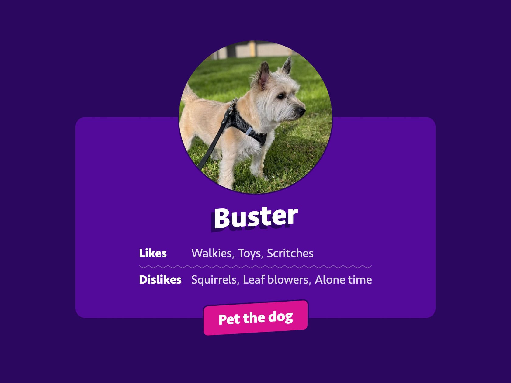
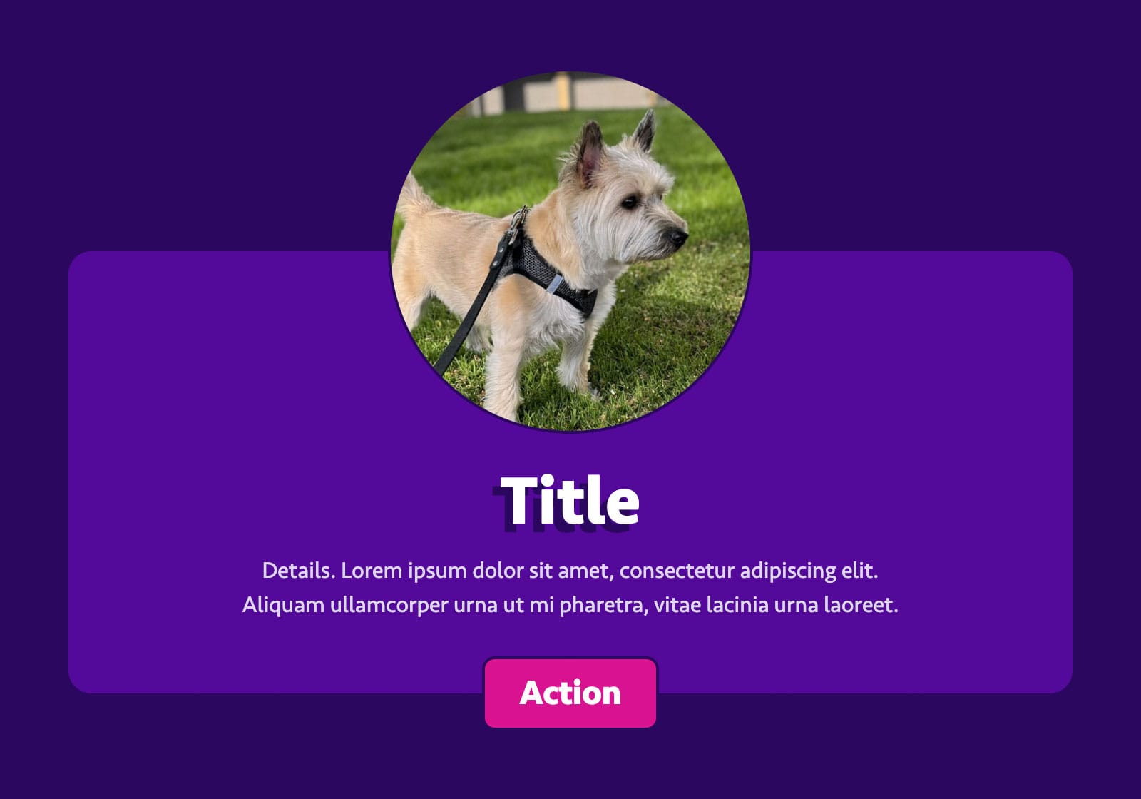
So sometimes for emphasis, visual interest or plain ol’ fun, we’ll let certain elements break out of their container. Like the image and button in this mockup:
Historically, these sorts of design touches have been a little tricky to implement. Will you use negative margins? Absolute positioning? Transforms? How do you reserve adjacent space so it doesn’t overlap content?
CSS Grid helps a lot, but I still see developers getting a bit tangled in complex, nested grids and subgrids, trying their best to stretch inner containers around the breakout elements while respecting the content therein. The results can be very impressive, but a little intimidating.
The advice I give to those overwhelmed by this task: Decouple the containing shape from its content! Make a faux container, and put that where you want it to go.
Here’s an example implementation of the card from that mockup:
Its HTML consists of just a few elements:
<div class="card">
  <h3 class="card__title">…</h3>
  <img class="card__image" src="…" alt="…" width="…" height="…">
  <div class="card__details">…</div>
  <button class="card__action" type="button">…</button>
</div>Code language: HTML, XML (xml)
Let’s walk through how those are styled.
Step 1: Basic Layout
We’re not going to worry about the breakout elements or containing shape quite yet. Let’s just get our elements in the order we want, using named areas to define their position:
.card {
  display: grid;
  grid-template-areas:
    "image"
    "title"
    "details"
    "action";
  text-align: center;
}

.card__title {
  grid-area: title;
  /* title size, color, etc. */
}

.card__image {
  grid-area: image;
  place-self: center;
  /* image dimensions, rounding, etc. */
}

.card__details {
  grid-area: details;
  /* styles for detail content */
}

.card__action {
  grid-area: action;
  place-self: center;
  /* button or link styles */
}Code language: CSS (css)
(The text-align and place-self properties are there to center-align content, per the mockup. May not be necessary for your own design or project.)
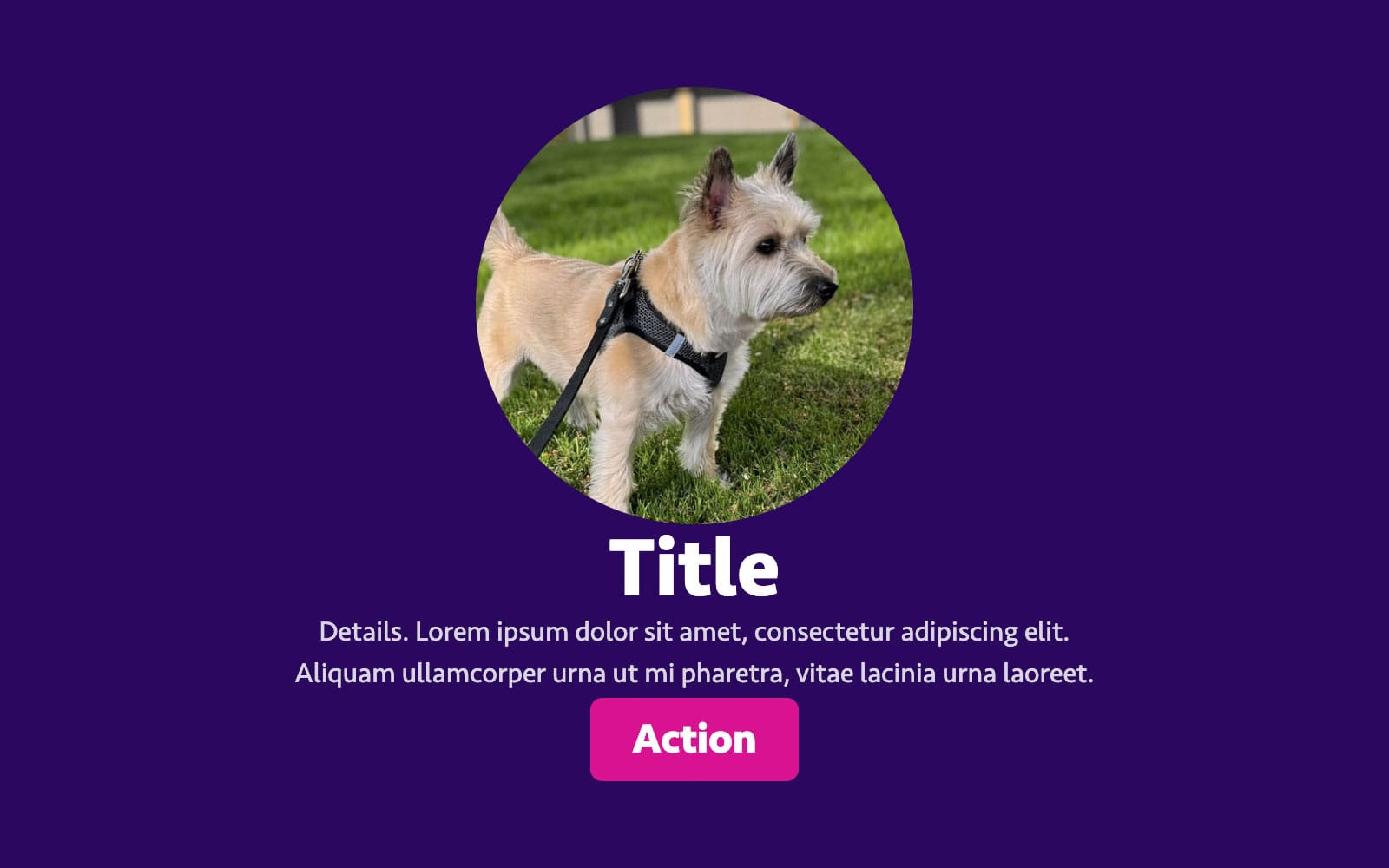
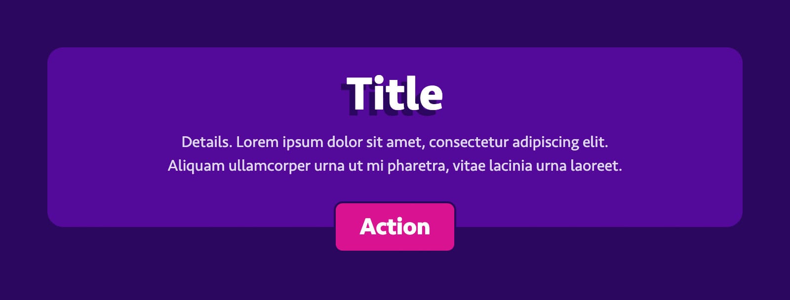
Here’s how that starting point should look:
Step 2: Adding the Faux Container
Now, it’s time to add our faux container styles. We’re going to use a pseudo element, for two reasons:
- We can position it independently of the
.cardand its children. - It doesn’t add any markup.
We’ll go ahead and give it a color, round the corners, set its content so it will render, and give it a grid-area (just like its siblings in the previous step):
.card::before {
  background-color: hsl(271 88% 32%);
  border-radius: 1em;
  content: "";
  grid-area: container;
}Code language: CSS (css)
Ah, but there’s a problem: We’ve set the grid-area to container, but that isn’t accounted for in the template we wrote in the last step. Plus, we need this element to visually wrap its siblings, overlapping the other grid areas.
We could replace grid-area with grid-column and grid-row:
.card::before {
  /* using line numbers */
  grid-column: 1 / -1;
  grid-row: 1 / -1;

  /* or existing names */
  grid-column: image / action;
  grid-row: image / action;
}Code language: CSS (css)
But then we’d need to manage our layout across two separate selectors. That can get a bit tedious, especially if we want to update the layout based on its viewport or container size.
Instead, let’s return to .card to combine our grid-template-areas with grid-template-columns and grid-template-rows. Using named lines, we can define a new area that spans these columns and rows, even though they’re already occupied by other areas:
.card {
  display: grid;
  grid-template-areas:
    "image"
    "title"
    "details"
    "action";
  grid-template-columns: [container-start] minmax(0, 1fr) [container-end];
  grid-template-rows: [container-start] repeat(4, auto) [container-end];
}
Code language: CSS (css)
(You may recognize the named lines technique from my previous article, or another I wrote way back in 2017.)
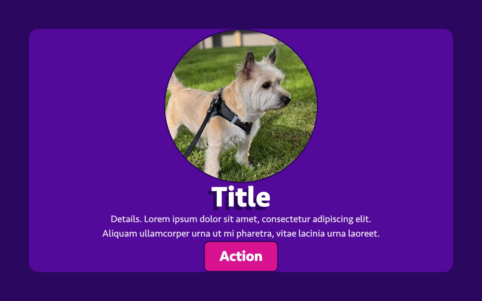
With that change, both content and container are in place:
Step 3: Breaking Out
So far, all we’ve done is create the world’s most over-engineered background-color. It’s time to break out of our containing shape.
To do that, we’re going to update our grid so that our image and action areas occupy two rows: One outside the container area, and another within. Let’s make a few changes:
- We’ll double up the
imageandactionrows ingrid-template-areas. - We’ll add two new rows to
grid-template-rows: One beforecontainer, one after.
.card {
display: grid;
grid-template-areas:
"image"
"image"
"title"
"details"
"action"
"action";
grid-template-columns: [container-start] minmax(0, 1fr) [container-end];
grid-template-rows: auto [container-start] repeat(4, auto) [container-end] auto;
}
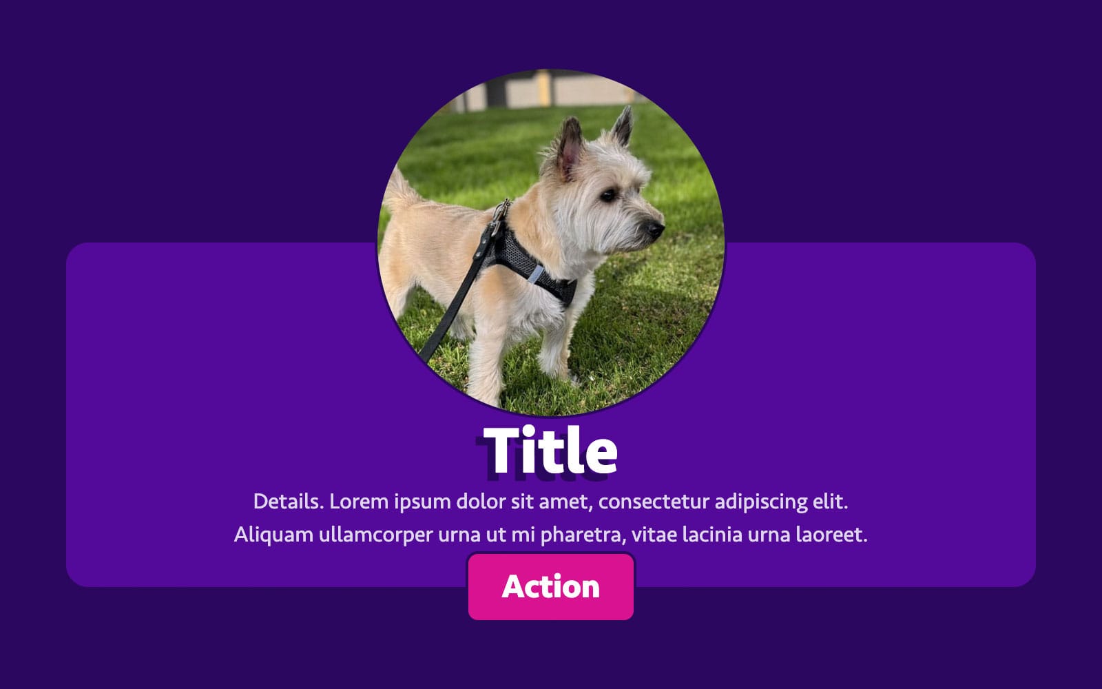
Code language: CSS (css)And voilà! Our container starts from the second row of image and ends after the first row of action:
Step 4: Gaps and Padding
Our layout’s coming along, but it feels a little snug. Normally, we’d fix that with the padding and gap properties. But in this case, padding will apply outside our faux container, and gap might throw off the alignment of our breakout elements (since they span multiple rows).
Instead, we’ll insert those spaces as their own columns and rows between our existing areas:
.card {
  display: grid;
  grid-template-areas:
    ". image   ."
    ". image   ."
    ". .       ."
    ". title   ."
    ". .       ."
    ". details ."
    ". .       ."
    ". action  ."
    ". action  .";
  grid-template-columns: [container-start] 1lh minmax(0, 1fr) 1lh [container-end];
  grid-template-rows: auto [container-start] auto 1lh auto 0.5lh auto 1lh auto [container-end] auto;
}Code language: CSS (css)
(Note the placeholder dots in grid-template-areas representing where the gaps and padding we added will go.)
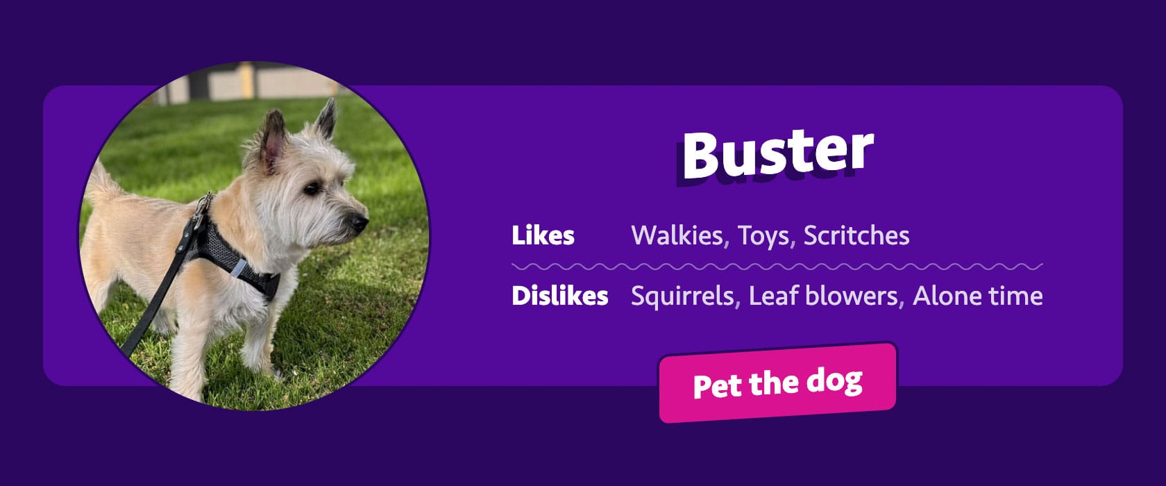
Phew! Now our content has room to breathe:
And with that, our faux container is done, and our card’s ready to style and polish.
It even falls back gracefully if either the image or button are omitted:
And we can use those same grid areas to adapt the layout to different viewports or containers. Here’s an example from the demo:
@container (inline-size >= 48em) {
  .card {
    grid-template-areas:
      ". image . .       ."
      ". image . .       ."
      ". image . title   ."
      ". image . .       ."
      ". image . details ."
      ". image . .       ."
      ". image . action  ."
      ". image . action  .";
    grid-template-columns: [container-start] 1lh auto 1lh minmax(0, 1fr) 1lh [container-end];
    grid-template-rows: 1lh [container-start] 1lh auto 1lh auto 1lh auto [container-end] 1lh;
  }
}Code language: CSS (css)
Which lets us enjoy that sweet, sweet horizontal real estate:
A Stepping Stone
Pseudo elements have drawbacks. Historically, some browsers have been fussy animating or transforming them. And they’re tough to manipulate with JavaScript.
You could switch out the pseudo element for an empty <div> instead. But if you’re going to add markup anyway, you might as well style an inner container. In that case, subgrid is your friend.
Either way, I’ve found the process of decoupling containing shapes from their children a helpful exercise for understanding the potential of CSS Grid. It’s a fun separation of content and presentation, and a big step up from absolute positioning or static background images!
Tyler Sticka has over 20 years of experience designing interfaces for the web and beyond. He co-owns Cloud Four, where he provides multidisciplinary creative direction for a variety of organizations. He’s also an artist, writer, speaker and developer. You can follow Tyler on his personal site, Mastodon or Bluesky.