Justified Text: Better Than Expected?

When it comes to Western languages, most long-form text you’ll encounter is either left-aligned (with an uneven, “ragged” right edge) or justified (with words spaced evenly across a line). But I’ve long avoided the latter in my web design work.
Why? Hyphenation.
To quote Matthew Butterick’s Practical Typography, “if you’re using justified text, you must also turn on hyphenation.” But hyphenation on the web can be tricky. In On Web Typography, Jason Santa Maria called hyphens: auto “crude,” warning that “the results are unpredictable.”
But over the holiday, I saw this Mastodon post from Nathan Knowler:
This is a fun little #CSS trio:
text-wrap: balance;
hyphens: auto;
hyphenate-limit-chars: 10;Code language: plaintext (plaintext)
Allowing hyphenation can help when balancing text. The last property (only supported in Chromium) sets the minimum length of hyphenated words to 10 characters which helps avoid undesirable hyphenation of smaller words.
This inspired Aileen, Paul and I to take a fresh look at justified text using CSS.
Justify My Prose
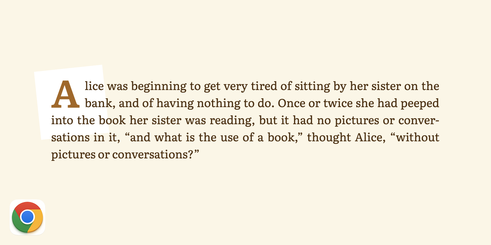
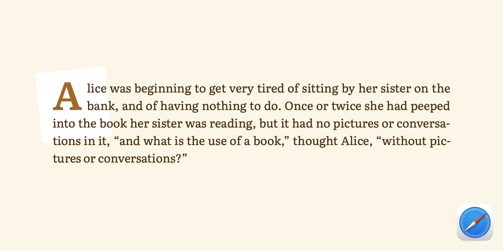
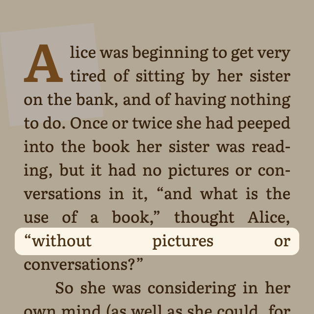
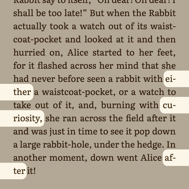
Paul suggested text from Alice’s Adventures in Wonderland by Lewis Carroll, a public domain work. In this example, I’ve aligned the first few paragraphs using four key CSS rules.
These two work in every browser:
text-align: justifyhyphens: auto
While these are only supported in Chrome and Edge as of this writing:
text-wrap: prettyto avoid orphans and widows. Nathan’s post mentionsbalance, but that has a line limit that doesn’t work with longer paragraphs. (See Stephanie Stimac helpful overview and Ahmad Shadeed’s deeper dive.)hyphenate-limit-chars: 7to discourage over-hyphenation. I doubt there’s any one, true value for this: It will depend on your design and content.
And here’s the result:
Observations
I was pleasantly surprised by the results in Chromium browsers at medium and large container widths. Hyphenation seems conservative and readable, yet there are no unsightly gaps or “rivers” between words. Safari and Firefox hyphenate a bit more frequently, but not distractingly so.
Narrower widths are still pretty hairy, though. Chromium browsers are prone to larger gaps, while Safari and Firefox split up words a bit too aggressively.
Takeaways
Left-aligned text will continue to be my recommendation and default approach. It’s more flexible and predictable when it comes to varying line lengths and content sizes and does not rely on automated hyphenation to maintain readability. From an accessibility standpoint, left-aligned text is easier to read for many people.
But when a design truly calls for finite, justified blocks of expressive typography, the combination of hyphens, text-wrap and hyphenate-limit-chars makes it a bit more viable than in years past. Just be sure to use responsibly, test thoroughly, and only apply when there’s adequate space and feature support:
@container (inline-size >= 30em) {
  @supports (text-wrap: pretty) and (hyphenate-limit-chars: 7) {
    /* Justify something here */
  }
}Code language: CSS (css)
Tyler Sticka has over 20 years of experience designing interfaces for the web and beyond. He co-owns Cloud Four, where he provides multidisciplinary creative direction for a variety of organizations. He’s also an artist, writer, speaker and developer. You can follow Tyler on his personal site, Mastodon or Bluesky.
