Designing Responsive Progressive Web Apps
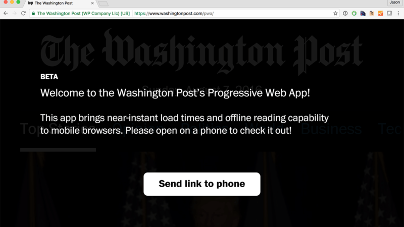
Designing responsive Progressive Web Apps forces us to tackle design challenges that we’ve been been able to side-step thus far. What do users expect from these new apps?
You appear to be offline, some content may be unavailable.
Designing responsive Progressive Web Apps forces us to tackle design challenges that we’ve been been able to side-step thus far. What do users expect from these new apps?

I’ve been experimenting lately with a new way to apply color values in my CSS. Instead of setting explicit values for each color, I calculate the entire palette from a small set of base colors.

Technical articles about Progressive Web Apps abound, but few tackle the question of why businesses should build Progressive Web Apps and why they should do so now.
Google’s announcement of Android Instant Apps caused me to fear for the future of the web for the first time. I’ve participated in many native versus web debates over the years. We even contemplated…
While iterating on a new article layout for the impending Cloud Four redesign, I encountered an old CSS layout problem. For long-form content, it’s usually a good idea to limit line lengths…
Many people know that you can scan your credit card in Mobile Safari. But how many web developers know how to create a form that supports that feature? Not many I’d bet. Auto-Fill…
Logos are an ideal use-case for SVG. Because they’re typically designed for reproduction and versatility, they’re almost always vector to begin with. SVG’s support of CSS and media queries means we can adapt brand…
Michael Mahemoff‘s recent article on how Progressive Web Apps have Leapfrogged the Native Install Model reminded me of a video I discovered while researching my new Adapting to Input talk. I keep revisiting…
It’s political season here in the United States, and it is great to see politicians taking technology issues seriously. Take Jeb Bush for example. His campaign has gone out of its way to highlight…
As a follow-up to my post discouraging the use of icon fonts, I recently wrote about the SVG icon process we’ve been using at Cloud Four. While most of the feedback I received…