Progressive Web Apps Simply Make Sense

Progressive Webs Apps versus native misses the point. Here is a simple case for Progressive Web Apps that even native app developers can agree with.
You appear to be offline, some content may be unavailable.
Progressive Webs Apps versus native misses the point. Here is a simple case for Progressive Web Apps that even native app developers can agree with.
Designing responsive Progressive Web Apps forces us to tackle design challenges that we’ve been been able to side-step thus far. What do users expect from these new apps?
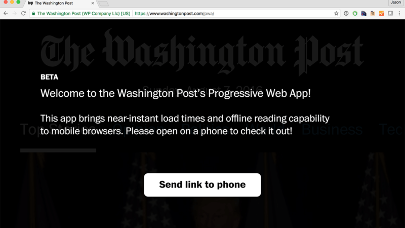
Technical articles about Progressive Web Apps abound, but few tackle the question of why businesses should build Progressive Web Apps and why they should do so now.

Here are four truths about input that have changed the way I look at the web. 1. Input is exploding The last decade has seen an explosion of new types of input. The pace of…

Part I of this series established that some of the challenges in building service workers for complex websites stem from having to accommodate page request variations. In this iteration, we’ll touch on how to…
Spending the last few days in New York City for Smashing Conference reminded me of an analogy for Mobile First Design that seems to resonate with people. If you’ve made your life fit in…
Google’s announcement of Android Instant Apps caused me to fear for the future of the web for the first time. I’ve participated in many native versus web debates over the years. We even contemplated…
It’s hard to believe it’s been over three years since Dave Rupert wrote Responsive Deliverables, challenging the rest of us to start making “tiny bootstraps, for every client.” It’s been almost as long since…

Last fall after the Umpqua Community College shooting in Southern Oregon, I decided that my donations and support for Everytown weren’t enough. I wanted to do more. And I wanted to do something…
Many people know that you can scan your credit card in Mobile Safari. But how many web developers know how to create a form that supports that feature? Not many I’d bet. Auto-Fill…