HSL: a color format for humans

Colors on the web are confusing — but they don't have to be! The HSL format makes it easy for humans and computers to work with color.
You appear to be offline, some content may be unavailable.
Colors on the web are confusing — but they don't have to be! The HSL format makes it easy for humans and computers to work with color.
By adding a touch of transparency, we can design components that automatically adapt to their backgrounds.
For many designers, the process of finding one's place within a design system can be surprisingly tough.
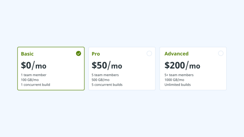
Sometimes labels for form fields are short and to the point. But other times, it’s helpful to provide users with more detailed information. Consider the common pattern of selecting a pricing plan for…
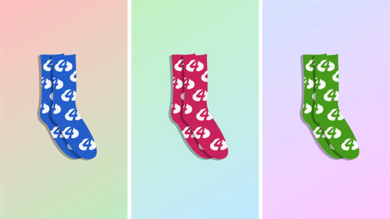
CSS filters unlock powerful new opportunities for playing with color. By applying some color theory we can dynamically generate harmonious color combos and gradients. Let's sell some socks!

Micro-interactions are small, singular interactions that serve one purpose: communicate meaningful feedback to users in a positive and welcoming way. People like to constantly know what’s going to happen when an action is performed and…
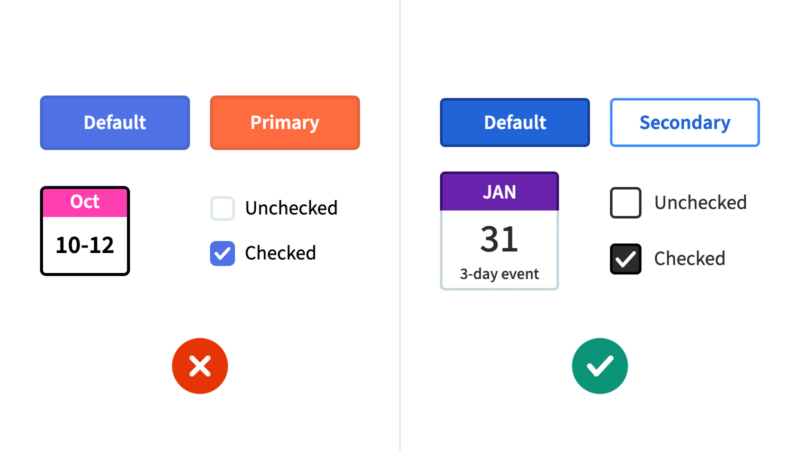
Our accessibility best practices have changed a lot in recent years, which we're reflecting in the next version of our design system.

As a front-end designer, I spend a lot of my time working in a browser with the developer tools open. This magical panel of tools provides some features that make my design workflows faster and…
In The Design Systems We Swim In, Ethan Marcotte asked a thoughtful question about design systems: Does the system you work with allow you to control the process of your work, to make…

Lately I've been using variables to plan out pure CSS timelines for complex animations. I built an SVG and CSS Rube Goldberg machine to put this technique to the test!