

App Modernization with Cloud Four: ImageQuix’s Blueprint for Success

ImageQuix worked with Cloud Four to design a web-based successor to their popular but aging Java application for independent photographers.
You appear to be offline, some content may be unavailable.
We designed and developed a responsive, performant, and accessible demo to explain and showcase how Cloudinary’s APIs help developers solve common problems. The demo increased engagement on the page it was embedded on by over 400% and improved the quality of visitor conversions.
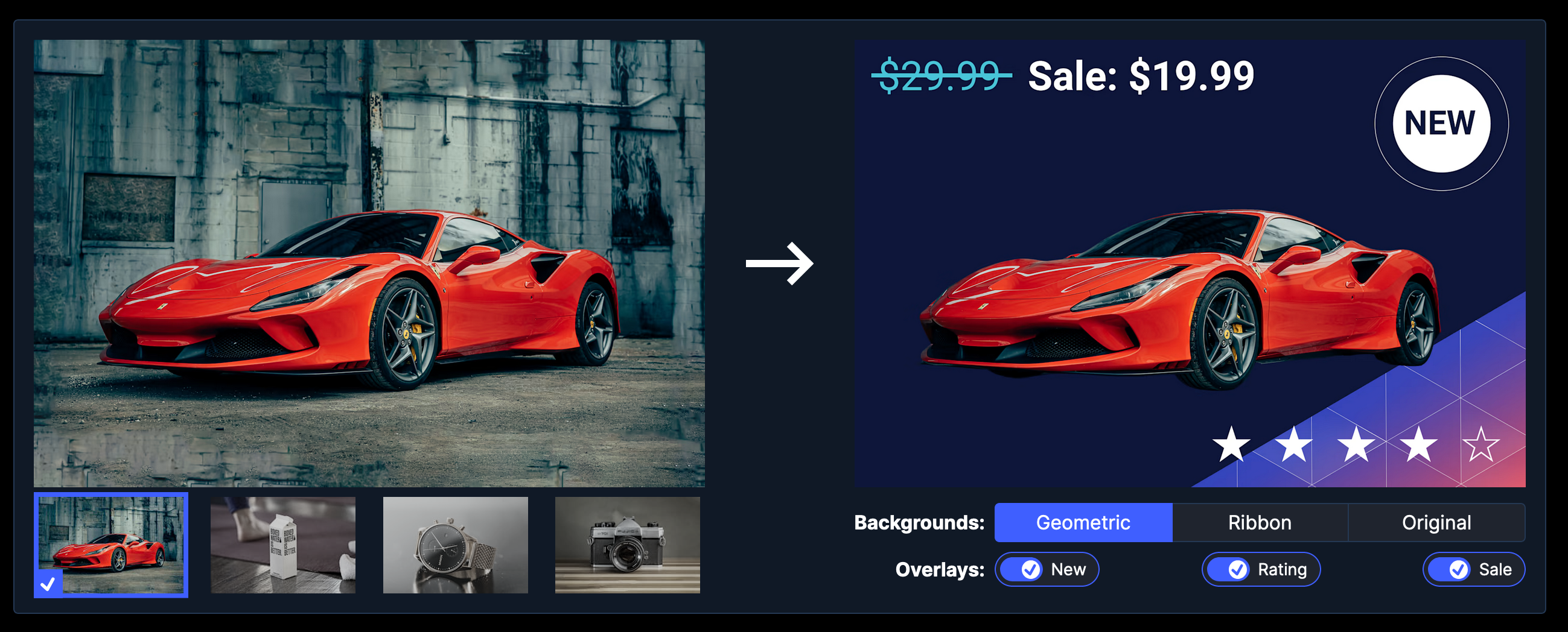
You can try the demo for yourself right here (this isn’t a screenshot):
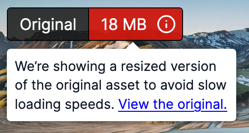
We’re showing a resized version of the original asset to avoid slow loading speeds. View the original.
We recently worked with Cloudinary to design a new page for their website showcasing their extensive and powerful APIs to developers. Cloudinary’s APIs make manipulating and optimizing images and videos easy, but it can be challenging to quickly demonstrate such a wide range of features.
We included an interactive demo to explain and showcase Cloudinary’s APIs while encouraging exploration, discovery, and engagement.
The API Explorer demo has been a big help in explaining our APIs to developers. It increased engagement over 400% and improved the quality of our conversions.
Sanjay Sarathy, Vice President of Marketing
We worked closely with Cloudinary to design and prototype a compelling demo. We performed initial discovery to better understand their product and positioning, brainstormed concepts and sketched potential ideas.
From there, we began prototyping in the browser to see how our ideas would work in the real world. For such an interactive experience, we needed more than a static mockup. Prototyping ideas in code allowed us to quickly understand what was working and what wasn’t. One of our earliest prototypes focused on the breadth of Cloudinary’s capabilities:
But as we tested the prototype, we realized it wasn’t quite right. It showed off a wide range of Cloudinary capabilities, but it wasn’t clear how they help developers solve everyday problems. An interactive prototype allowed us to realize this quickly and pivot to a new design focusing on four common use cases:
Now we were on the right track! Visitors could swiftly find the right solution to their specific problem. Our friends at Cloudinary agreed… in fact, they liked it so much that they didn’t just want to use it on the Developers page. They wanted to be able to use it on other pages as well as on their separate documentation site!
We needed to step back and determine how our final product could be used in these different contexts. For this type of complex, interactive experience, we wanted to be able to use a modern, component-based JavaScript framework. But we needed to be able to embed this in their WordPress (PHP) marketing site, as well as a statically-rendered Ruby documentation site.
We had a few important requirements for the final deliverable. It had to be:
We’d worked with Cloudinary to rebuild their blog, and we knew that performance was a top priority for them. We were able to leverage our knowledge from this previous work to help them achieve their goals for this demo.
After discussion with our Cloudinary stakeholders and their technical team, we landed on a three-pronged approach:
With our goals in mind, and a plan to achieve them, we got to work. We built out a set of reusable Preact components and API endpoints to power the demo experience:


These modular components allowed us to quickly build out the different demo use cases. We’re also able to reuse these components to power other experiences with Cloudinary.


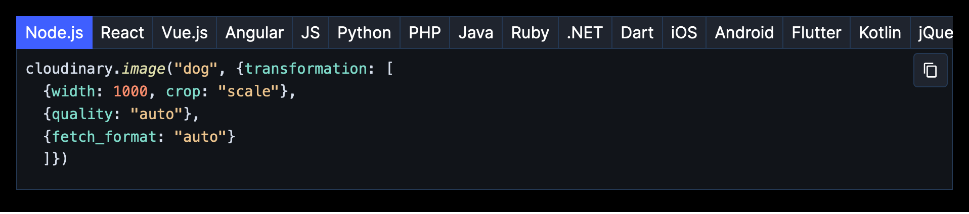
This process was streamlined by building off of our previous work and experience. For example, we leveraged an image comparison web component we’d already built instead of starting from scratch.
You can try the component right here! (It’s not a screenshot.)
The demo was a huge success. The final result is engaging, performant, responsive, and accessible. It was quickly integrated into Cloudinary’s site without any issues or downtime. Cloudinary even integrated the demo on additional pages we weren’t planning for, including other pages on their primary site and landing pages for targeted ad campaigns. It drastically increased engagement on the Developers page and helped customers understand Cloudinary’s APIs.
Cloud Four is hands down the best agency I have ever worked with on any web project ever in my 25+ web career.
Daniel Divens, Former Director, Website Marketing
We solve complex responsive web design and development challenges for ecommerce, healthcare, fashion, B2B, SaaS, and nonprofit organizations.
ImageQuix worked with Cloud Four to design a web-based successor to their popular but aging Java application for independent photographers.

We created a deeply integrated, multi-brand responsive design system to redesign and unify multiple web experiences for Baptist Health, a healthcare system in Northeast Florida and Southeast Georgia.