From Drizzle to Storybook
Why we're changing up our pattern library UI after four years of rolling our own bespoke solution.
You appear to be offline, some content may be unavailable.

Why we're changing up our pattern library UI after four years of rolling our own bespoke solution.

When it comes to side projects, micro-sites and one-off experiments, you don't need much to get started.

A frustrating struggle to keep a tiny native app alive reminds me why I appreciate the web.

What CSS could I be writing tomorrow that might seem far-fetched today?

We do a lot of rapid prototyping at Cloud Four, which means we’re often working with incomplete or hypothetical content. When it comes to FPO images, we’ve relied on a few different solutions: Third-party services…
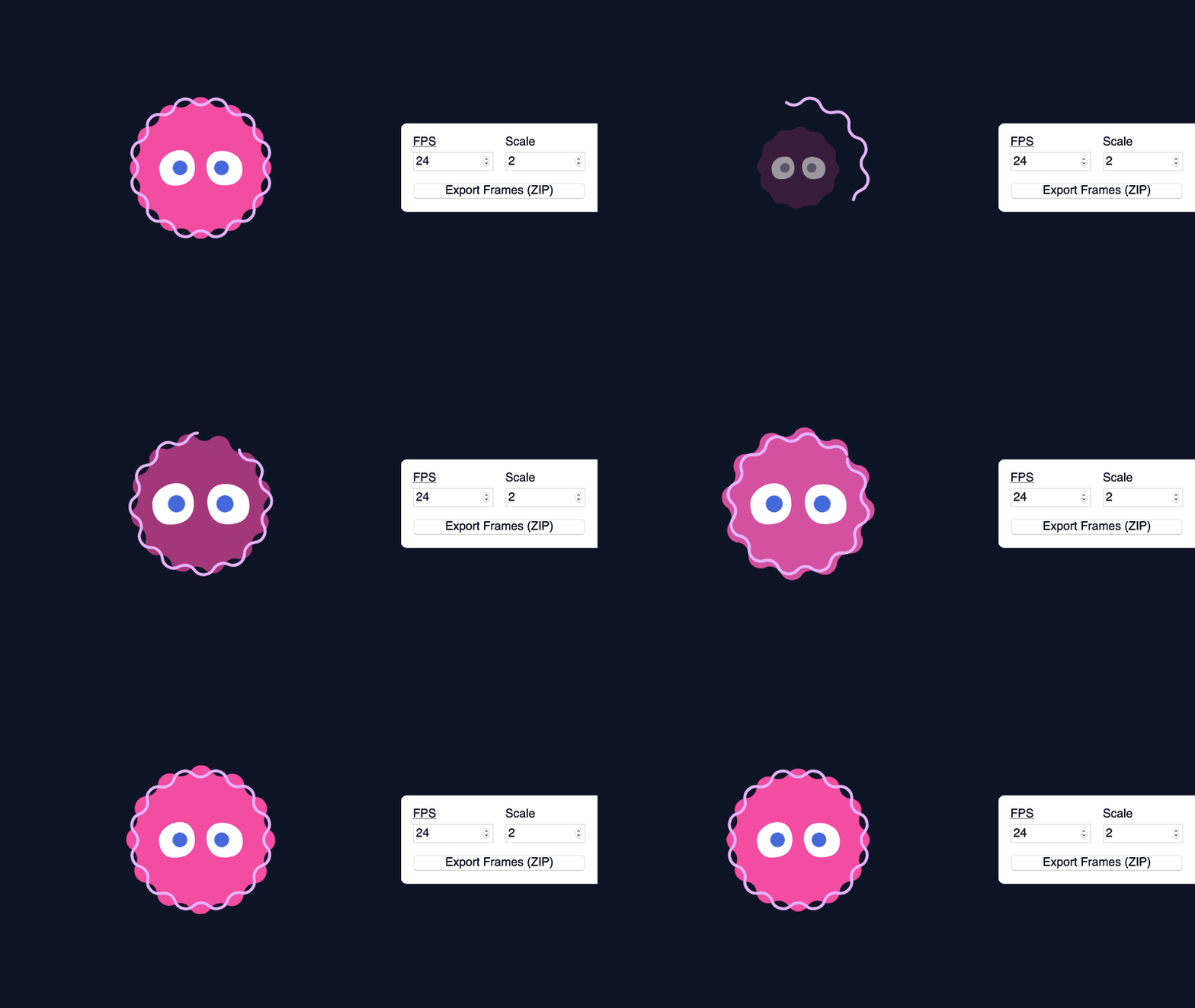
How I avoided relearning software (and gained some superpowers) by exporting my SVG and GSAP animations to bitmap sprites.
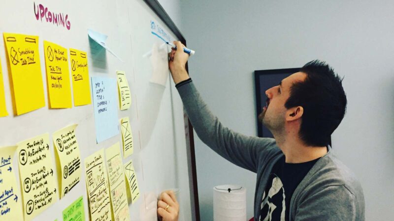
A loosely organized and inexhaustive list of feedback and suggestions I frequently give designers.

I accidentally became Cloud Four's resident expert on dynamic circular containing elements. Here are my tips and tricks.
After years of defaulting to PostCSS as our CSS processor of choice, we've recently considered reintroducing Sass to our stack.

Strategies for when the goals of your project, team or users diverge from those of an established design system.