Truth, Lies and Progress Bars

Very early in my career, I found myself on a design team tasked with improving some legacy security software. At one point, we were evaluating a setup screen that included a progress bar. I asked a member of the engineering team, “How is progress calculated?”
“Oh, it’s complete nonsense,” they replied with a chuckle. Then they explained…
The progress bar filled every few seconds, regardless of actual progress. The first cycle filled by a set amount, then a fraction of that, then a fraction of that (etc.), so the bar would never completely fill on its own. Once the operation actually finished, progress jumped from wherever it happened to be to 100%.
Today, I can spot this sort of trickery a mile away. But at the time, I was young, naive, and a little appalled by this explanation. “You’re lying to the user?” I thought.
Thankfully, I chose to ask a more productive question aloud…
“Why?”
I was told this particular operation was complex, with a lot of different factors that could vary wildly from user to user. This made it challenging to predict ahead of time, and resource-intensive to estimate dynamically.
If they included no progress indicator, or even a repeating animation like a spinner or indeterminate “barber’s pole” bar, users might worry some aspect of the process had stalled or crashed. They might cancel the operation unnecessarily.
It was decided that a fictional progress bar was a necessary evil. By demonstrating some amount of forward momentum, users felt more confident that the operation was continuing as intended, with fewer abandoning the setup process.
Doing Better
I had mixed feelings about that explanation.
On one hand, the artificial progress indicator solved some of the challenges the team described. It exposed me to the concept of perceived performance and reminded me to always question assumptions.
On the other hand, making stuff up felt like the lowest possible bar to reach.
Thankfully, I’ve since had plenty of opportunities to design more forthcoming progress indicators within similar constraints. The process is always the same:
- Collaborate with engineering to detail exactly how the operation works.
- Research and understand the context for this step, its role in the user’s journey.
- Visualize progress based on knowns rather than unknowns.
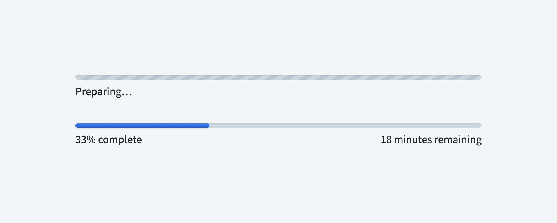
Sometimes, you’ll discover more accurate estimation is possible, and worth a small amount of performance loss to provide overall clarity to the end user:
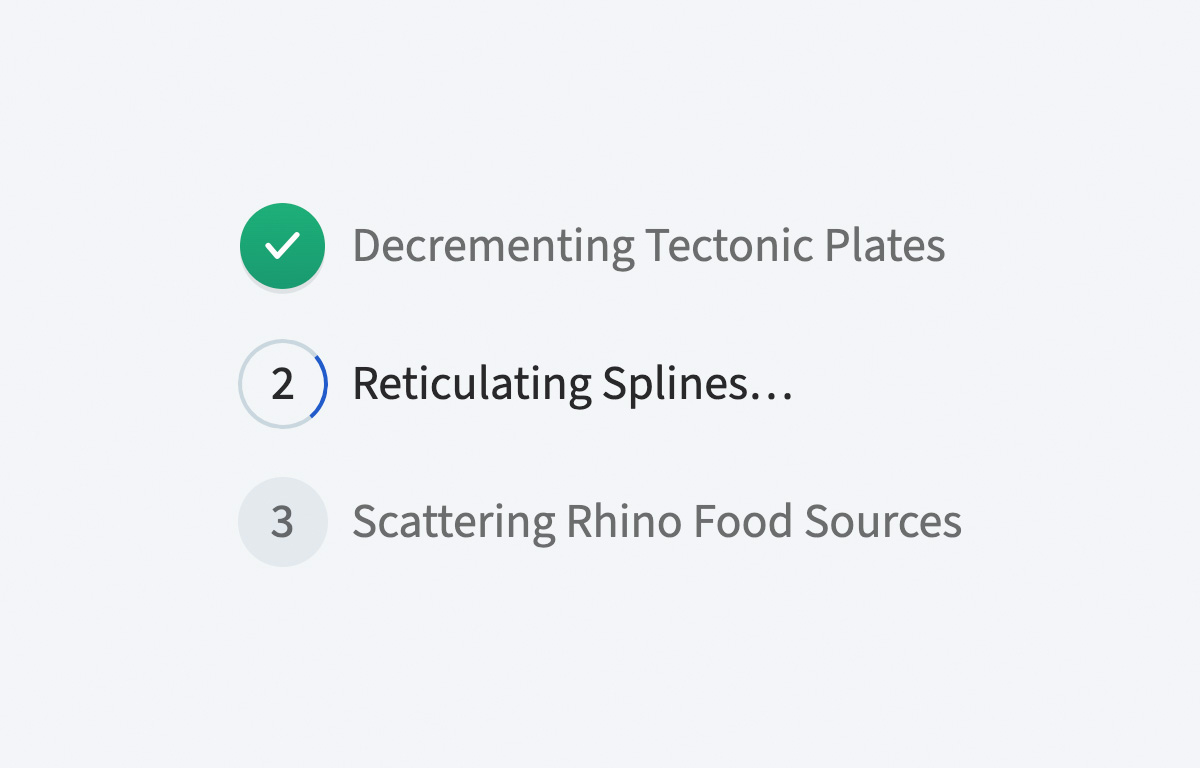
Other times, an ETA just isn’t feasible or appropriate. If you know what step of the operation you’re on and how many remain, you can visualize total progress without relying on time:
If the total number of steps isn’t knowable, counting the number of completed steps so far reassures users that progress is happening:

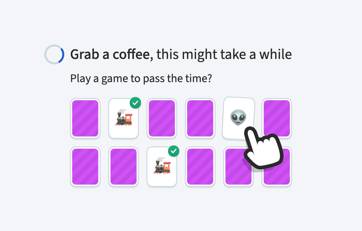
Even when all else fails, be honest. And if you can, make it fun:
Tyler Sticka has over 20 years of experience designing interfaces for the web and beyond. He co-owns Cloud Four, where he provides multidisciplinary creative direction for a variety of organizations. He’s also an artist, writer, speaker and developer. You can follow Tyler on his personal site, Mastodon or Bluesky.
