Preferred solutions for responsive images

Scott Jehl recently tweeted:
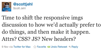
I concur. A couple of months ago, I asked what you preferred as a solution for responsive images. At the time, I didn’t have a strong opinion. But over the last couple of weeks, I’ve become increasingly comfortable with a direction that Scott Jehl, Ethan Marcotte and I discussed on twitter recently.
Short run solution: preparse attribute
In September, Scott Jehl proposed a solution that might be fairly easy for browser makers to implement in the short run: adding a preparse attribute to the script tag.
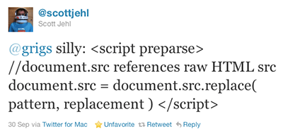
Like the defer and async attributes, there is a general use case for document authors to be able to tell the browser that a piece of javascript will impact the loading of assets and thus should be executed before parsing begins. There are probably even use cases that have nothing to do with asset downloading where telling the browser to execute javascript before parsing would be beneficial.
One of the other suggestions for solving this was for browsers to standardize on how they load assets. I don’t like that idea because it prevents browsers from experimenting on ways to parse pages and load assets more quickly.
If authors explicitly tell the browser when javascript loading matters (preparse, defer or async), it allows browser makers to experiment freely in other situations.
Long run solution: improvements to img tag
In the long run, I don’t like the idea that solutions require javascript. Images are content or presentation which means it should be possible to handle it with HTML and CSS alone.
Therefore, I would like to see one of these two improvements to the img tag:
<img alt="butterfly">
  <source src="butterfly-small.png" media="max-device-width:480px" />
  <source src="butterfly-large.png" media="min-device-width:481px" />
</img>
Modified from Bryan and Stephanie Rieger’s Rethinking the Mobile Web talk.
This is my preferred option, but I’m unclear on how older browsers would handle an image tag that contains child elements.
Isaac Lewis put together a test page using this style of markup. It would be great to collect some feedback on old browser support to see if it works or causes problems.
If that won’t work because of legacy browsers, the following variation proposed by Anselm Hannemann should:
<img src="http://cdn.url.com/img/myimage_xs.jpg"
     media-xs="(min-device-width:320px and max-device-width:640px)"
     media-src-xs="http://cdn.url.com/img/myimage_xs.jpg"
     media-m="(min-device-width:640px and max-device-width:1024px)"
     media-src-m="http://cdn.url.com/img/myimage_m.jpg"
     media-xl="(min-device-width:1024px)"
     media-src-xl="http://cdn.url.com/img/myimage_xsl.jpg"
/>
Why not headers?
I would love the browser to send more data to the server about the device making the request, but I don’t think servers should be necessary for the image tag to work in a responsive design.
I also think there is a decent chance that screen size is just the first of many headers we’d like the browser to send along. I don’t want to open up pandora’s box, but it would be nice to get something that felt more like a comprehensive solution instead of a bandaid.
Why not a different, progressive image format?
I’d love this, but feel wholly unqualified to judge what it would take. I’m not sure how long something like that would take to implement and what sort of patent minefield might lie there.
So let’s start with the preparse attribute
Unless someone points a major flaw with the preparse idea, I’m going to submit it as a feature request to the appropriate people to get the ball rolling.
Which reminds me, does anyone know where I should start? 🙂
Jason Grigsby is one of the co-founders of Cloud Four, Mobile Portland and Responsive Field Day. He is the author of Progressive Web Apps from A Book Apart. Follow him at @grigs.